Main
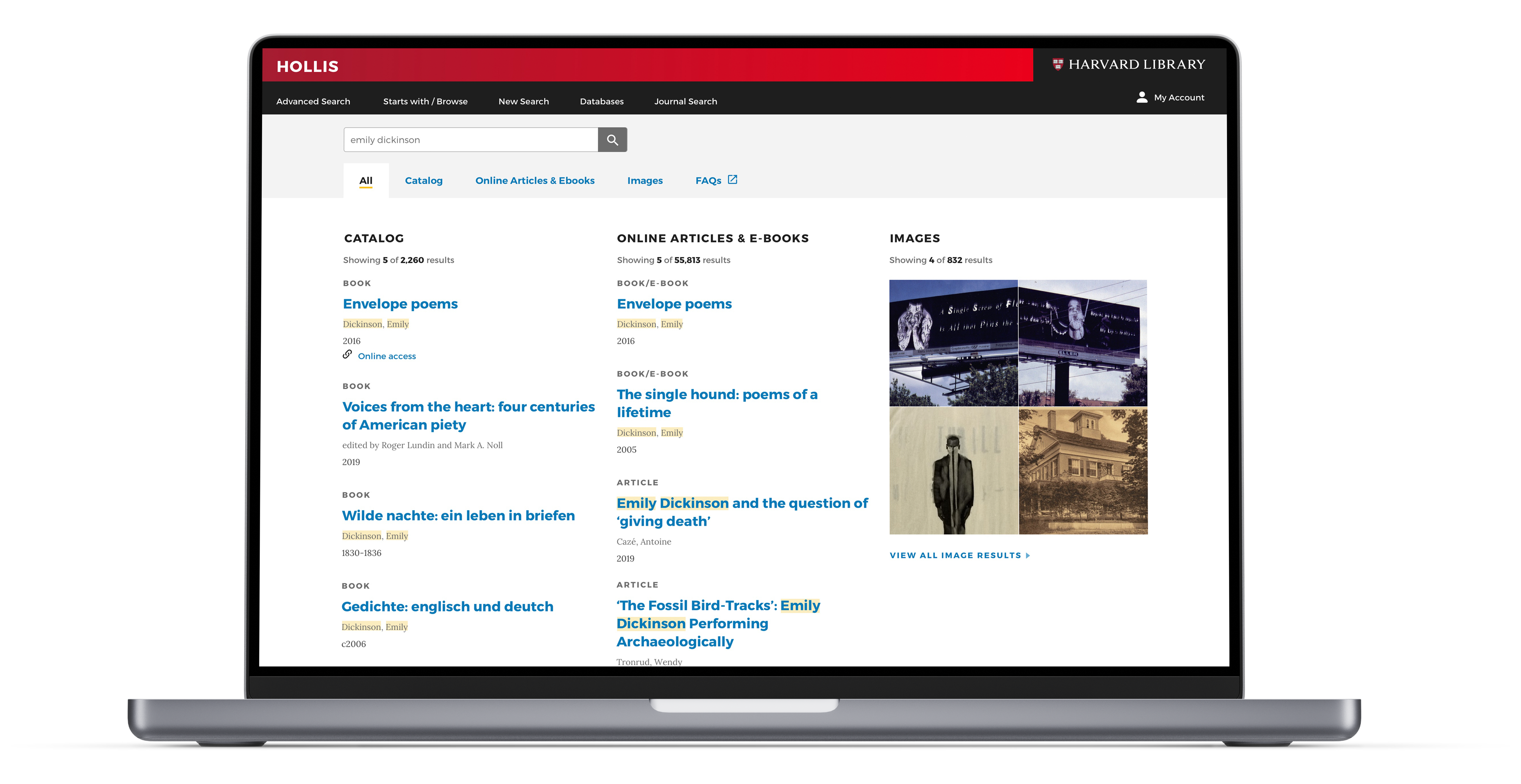
Library search, as one if the most frequently used function among the library website, has great educational impact on the Harvard University community. We aim to better understand how we can better support researchers to find library resources more efficiently, and what presentation layout would benefit our primary audience in the Harvard community. At the end of this project, we delivered some hi-fi prototypes for further testing and future iterate design.
• Project timeline
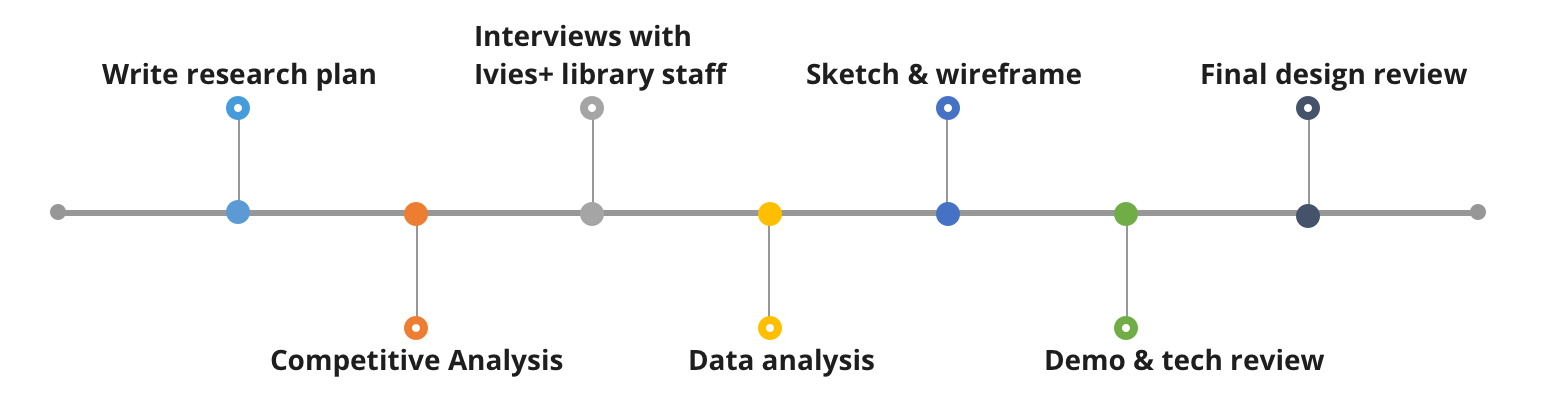
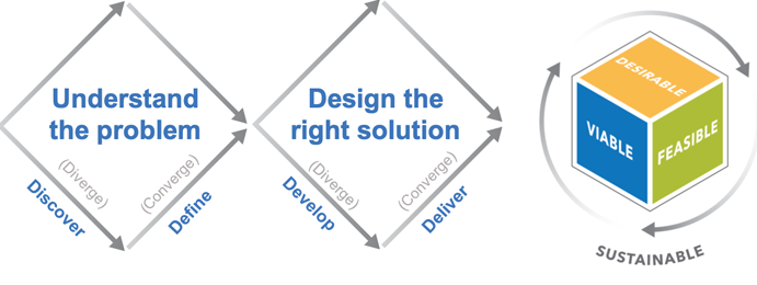
Folloing a design thinking process, we uncovered user's need and perform user-centered design. In order to better understand users' real needs, we conducted user interviewing with our end-users and defined users' painpoints and our project's goals. Then we did comparative resaerch to analysis similar exsitiing products on the market and brainstormed on potential solutions and ideas. Then we conducted Expert Interview to validate our solutions. Finally, we prototype and conducted user testing to iterate our design solutions.
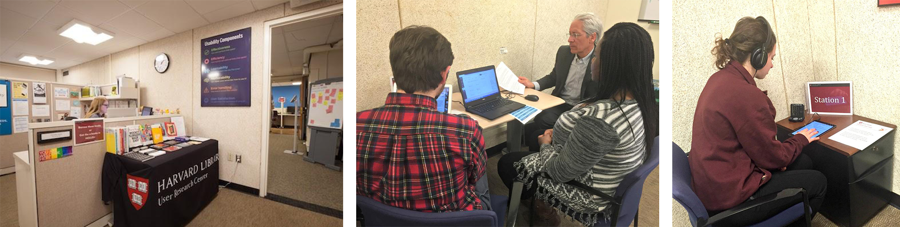
We conducted 8 interviews with our end-users which include undergraduate students, graduate students, Ph.D. students, and university staff. For each interview, we started by asking them to tell us what degree they are pursuing or what they do at the university. We noticed a big difference between students and staff about their attitudes toward the library search function. And then we asked them how they currently use the library search function to help them with their study, following with questions invited them to talk about the pain points when using this function. After the interview, we felt we have a better understanding of what problems and needs we should resolve in our design.
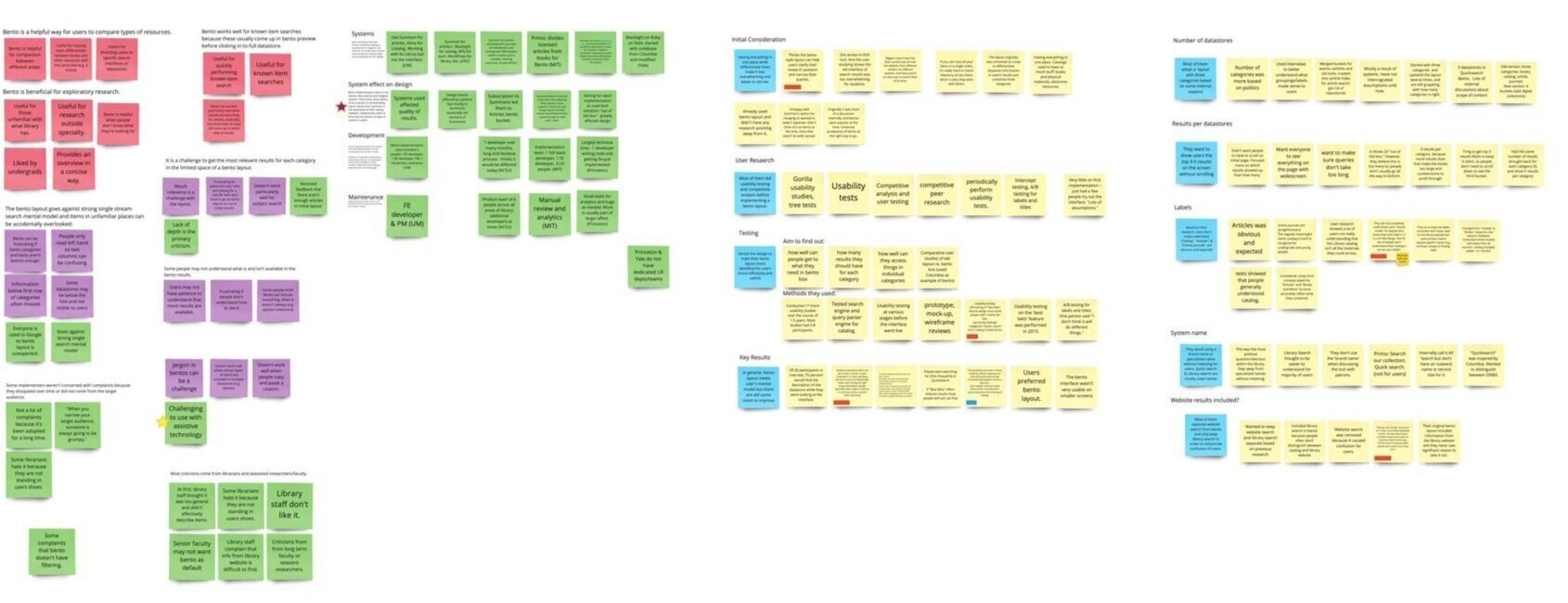
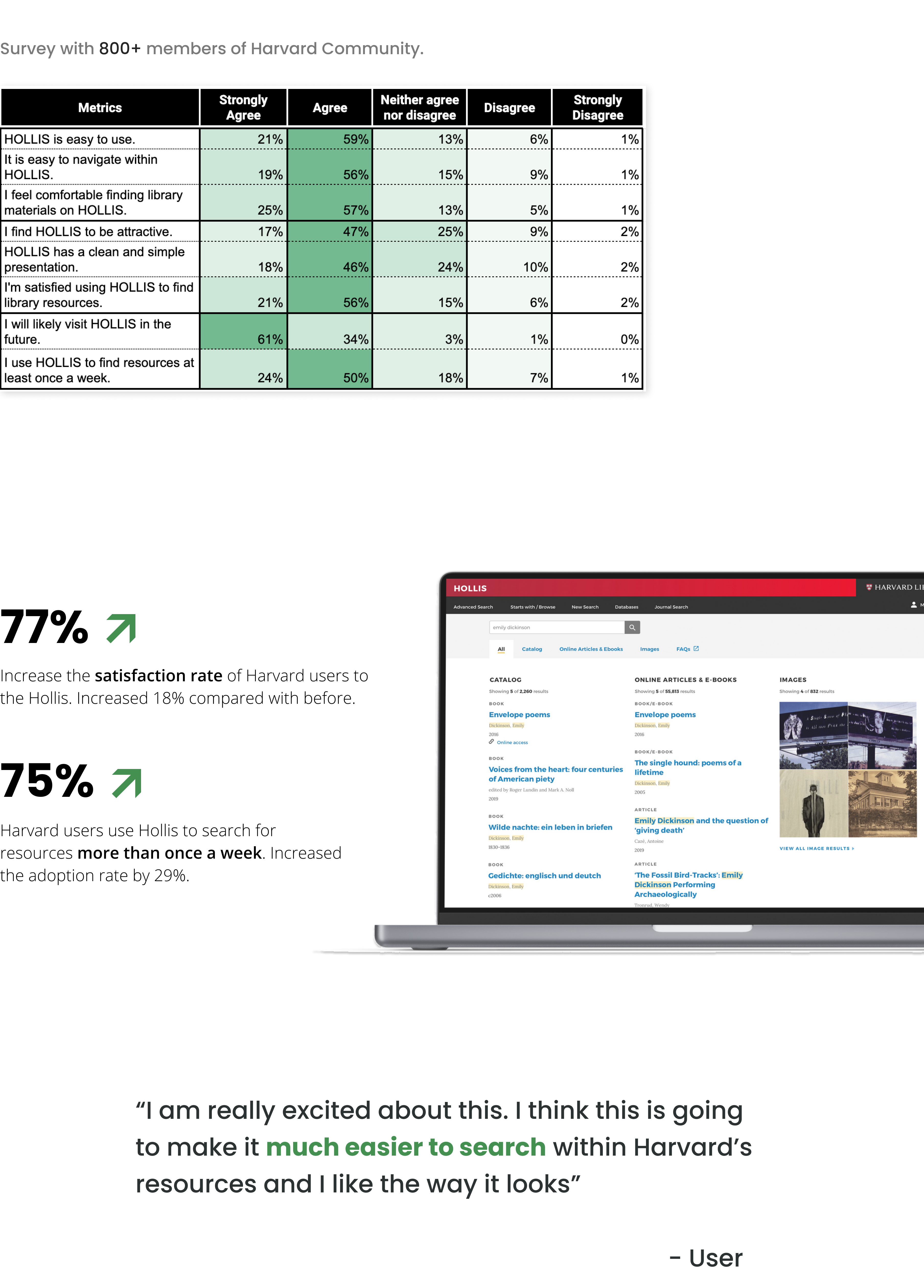
After the interviews, we categorized our notes into different categories in oder to see how they felt about the current search function and understand their unsolved needs. (Based on the research results we got, bento layout can benefit novice users by introducing users to the scope of library holdings within a single interface. This added step aligns with users’ mental models. We need to consider how many categories we want to have on our page so it can give users some clues while not become too overwhelming.)
Insight 01
Users don't know what resources Harvard Library has.
How might we help users to better understand what resources we have?
Insight 02
Users don't know where to go to get those resources.
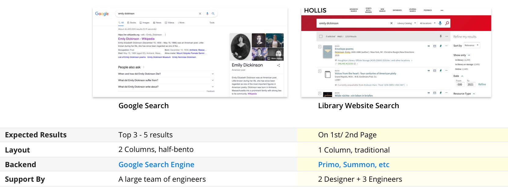
Very little usage of havard.library site, direclty start with google
Users don't know where to go and have very low confidence when they don't see their expected information in the top 3- top 5 results. Unlike Google, most universities (include Harvard) rely on backend systems from other companies and they have very limited resources to integrate these systems. This technology gap makes it impossible for libraries to provide results as Google does.
How can we bridge the technology gap with design and provide a better search experience for library audiences?
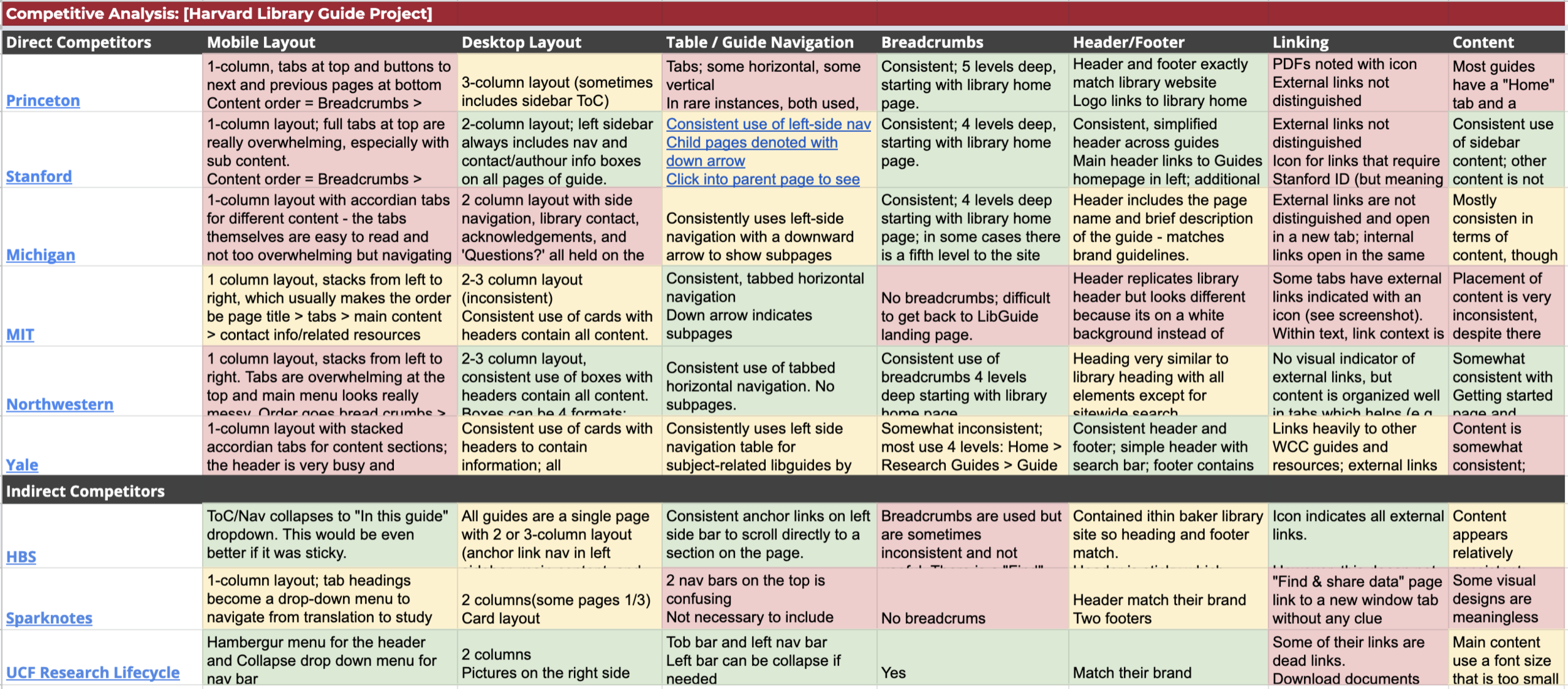
We conducted comparative research to see what are the potential solutions in the market and what are other institues' approach of solving this problem. First, we identified theinstitutes, museums, and organizations that we want to take a look at. Then we started creating this matrix below and gathering Information. Finally, we discussed the strengths and weaknesses of each competitior's solution.
.jpeg)
Ideation & Sketch
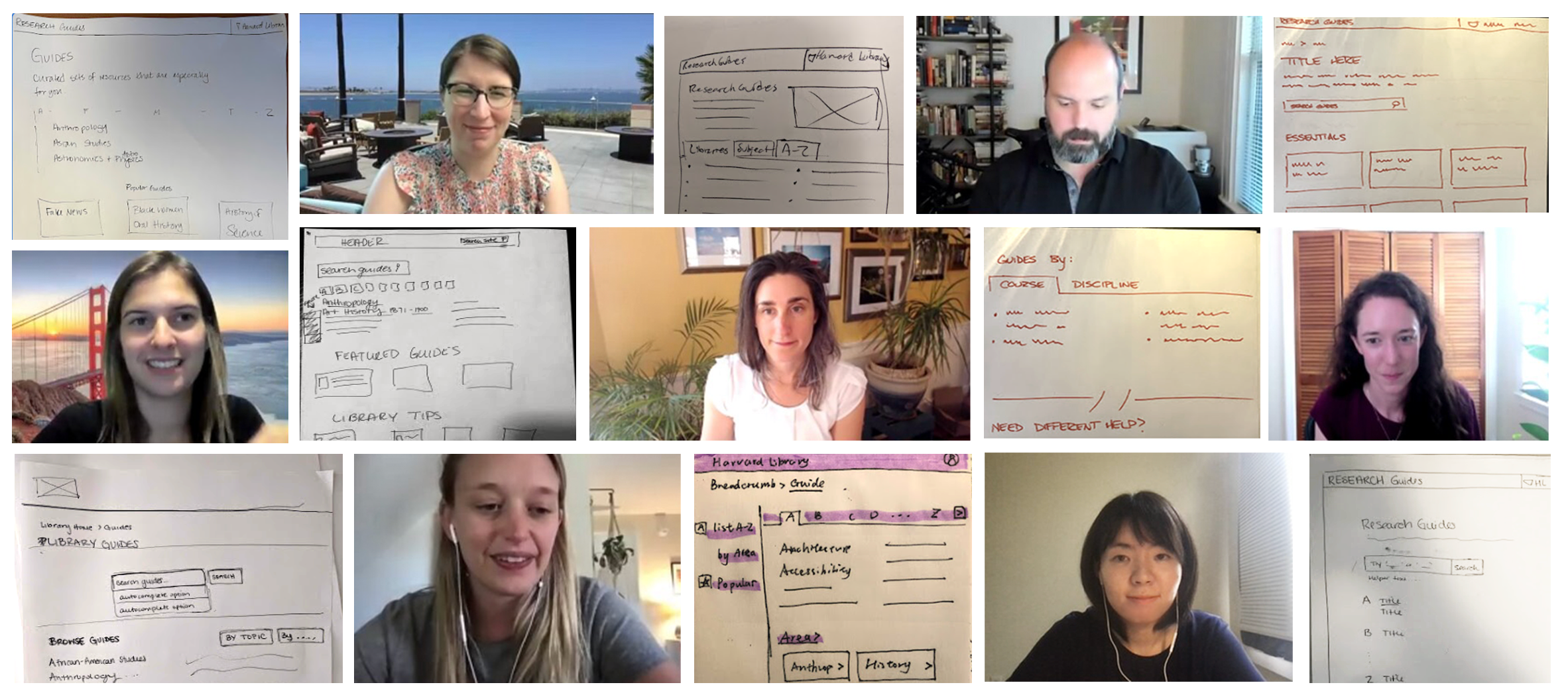
Expert Interviews
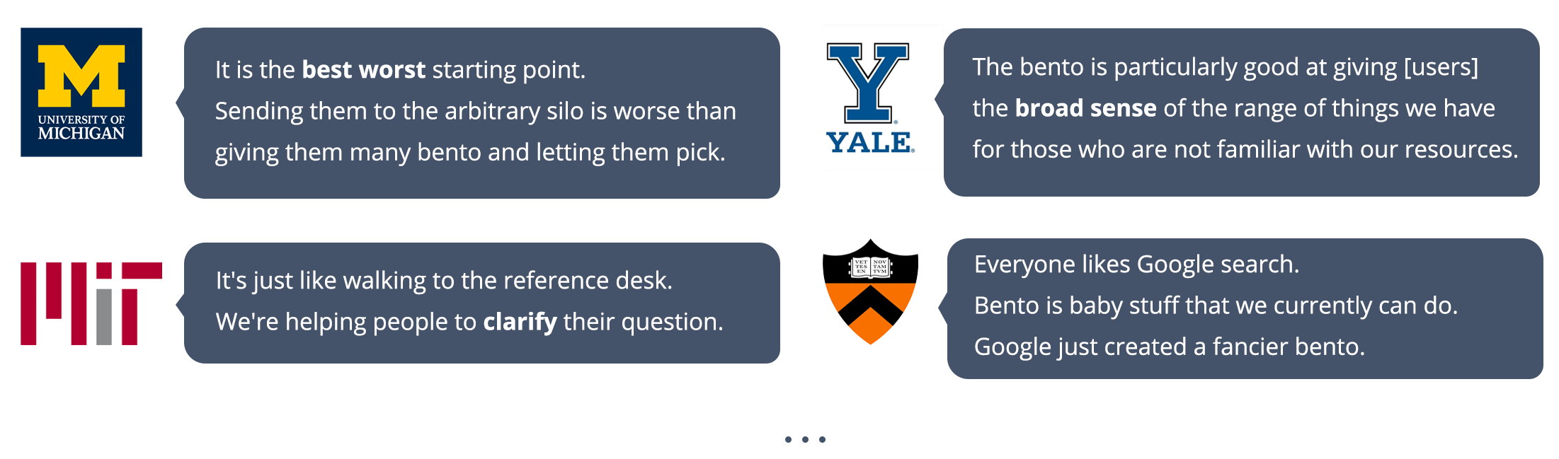
7 interviews were conducted with 10 participants who represent 6 universities:
• University of Michigan
• University of North Carolina - Chapel Hill
• North Carolina State University
• Massachusetts Institute of Technology
• Princeton University
• Yale University
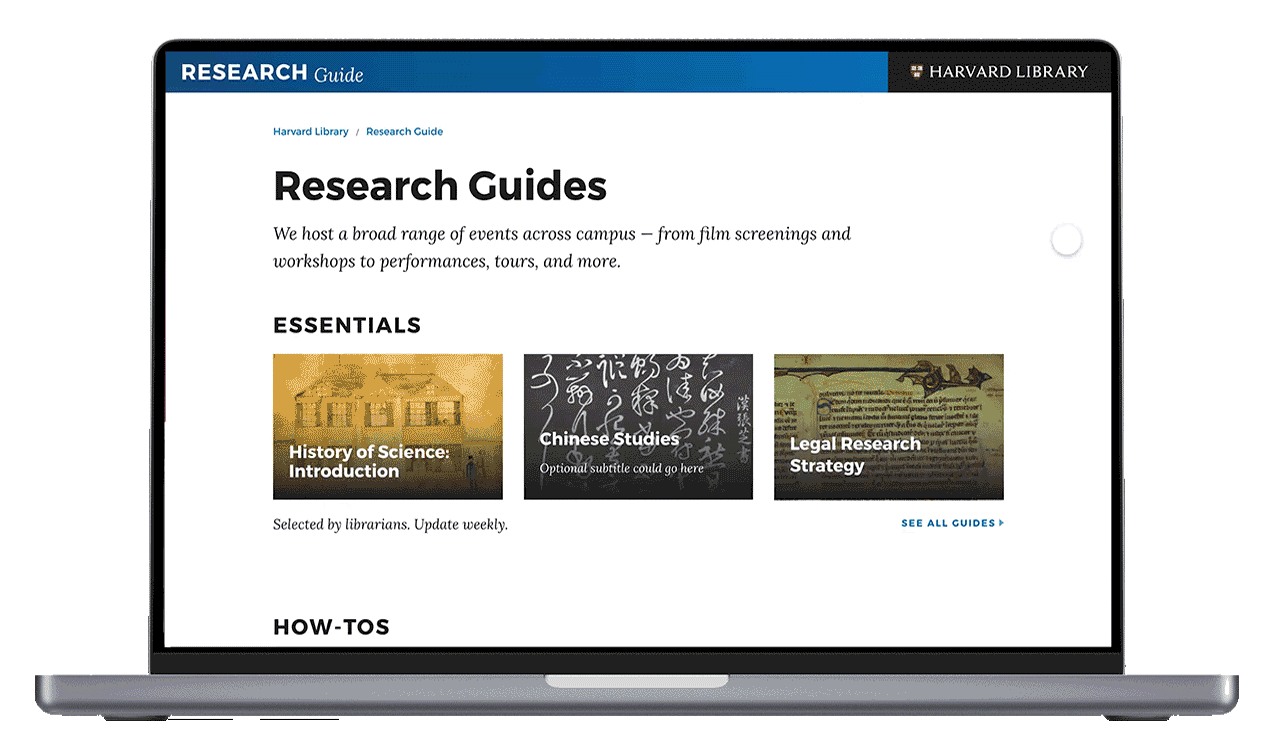
Prototypes
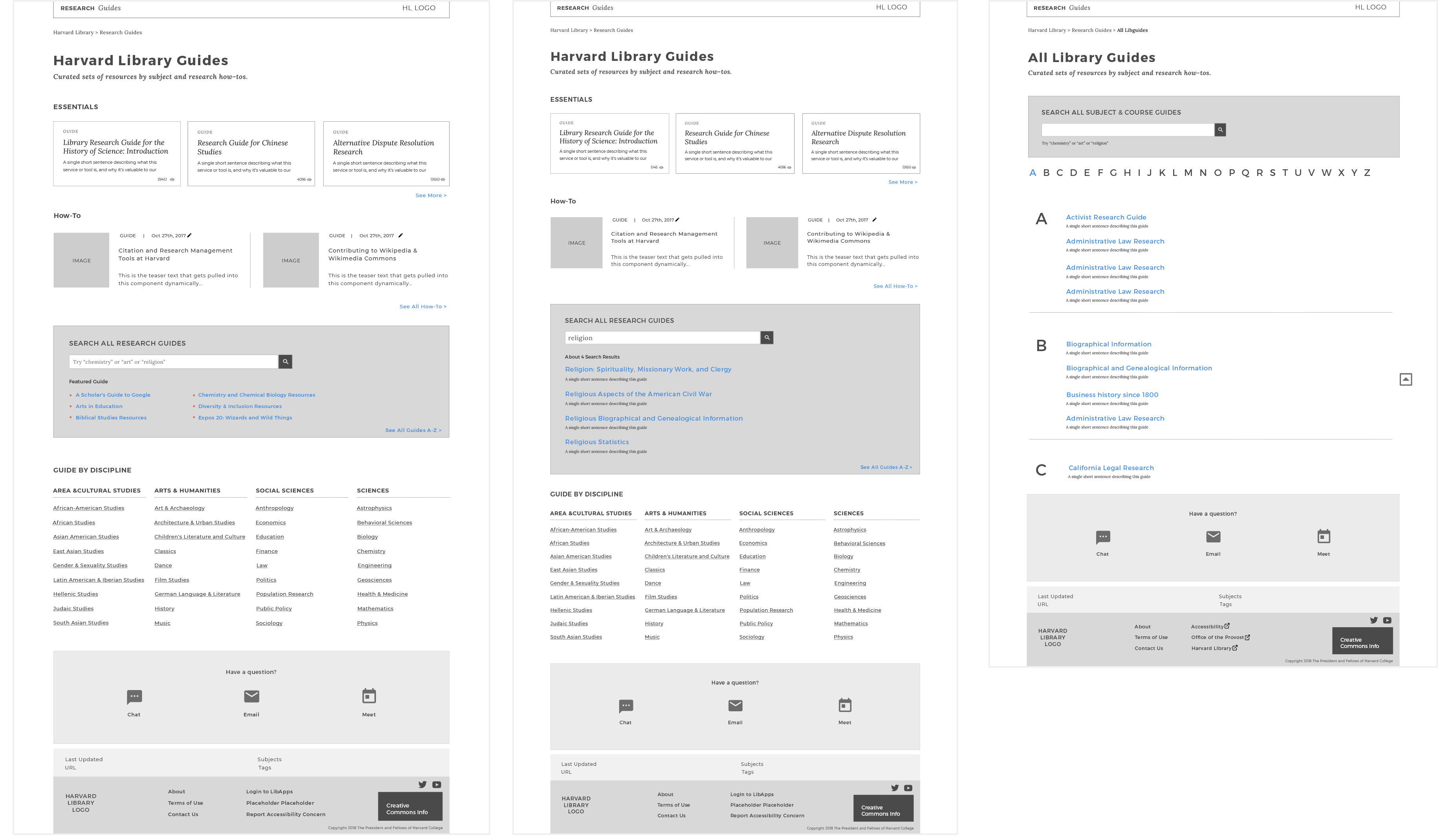
Prototypes of research guide pages
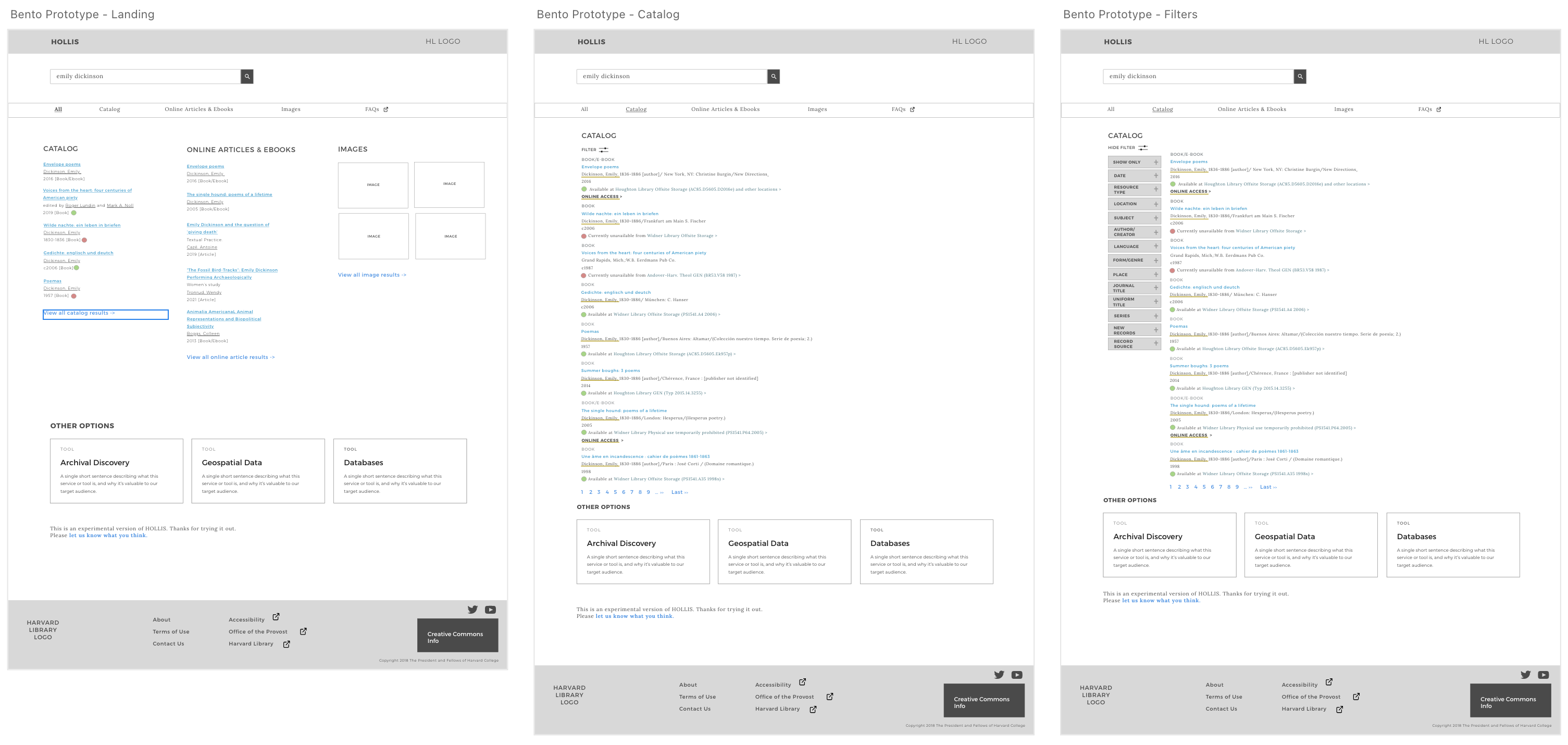
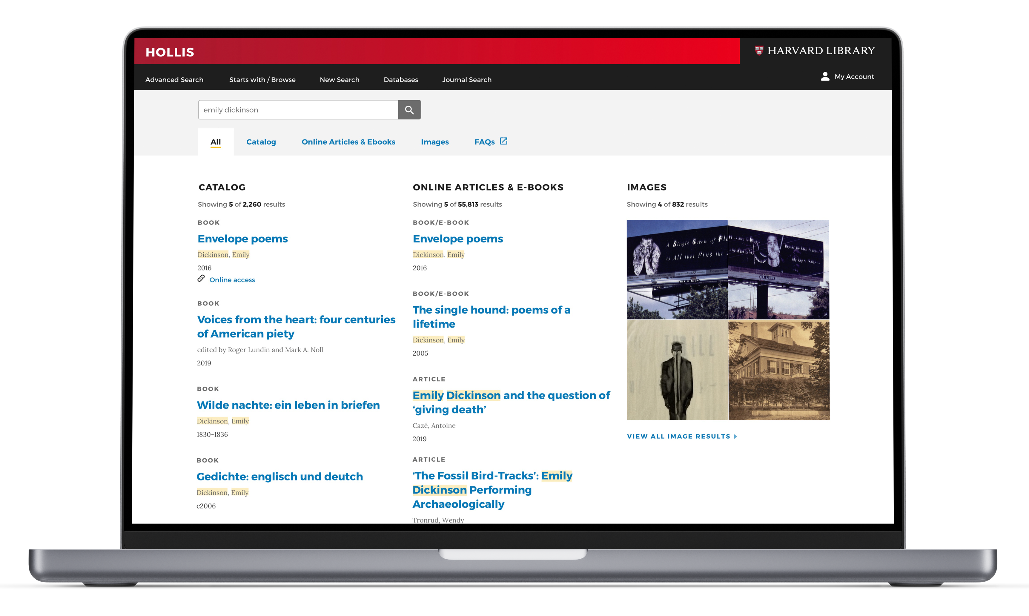
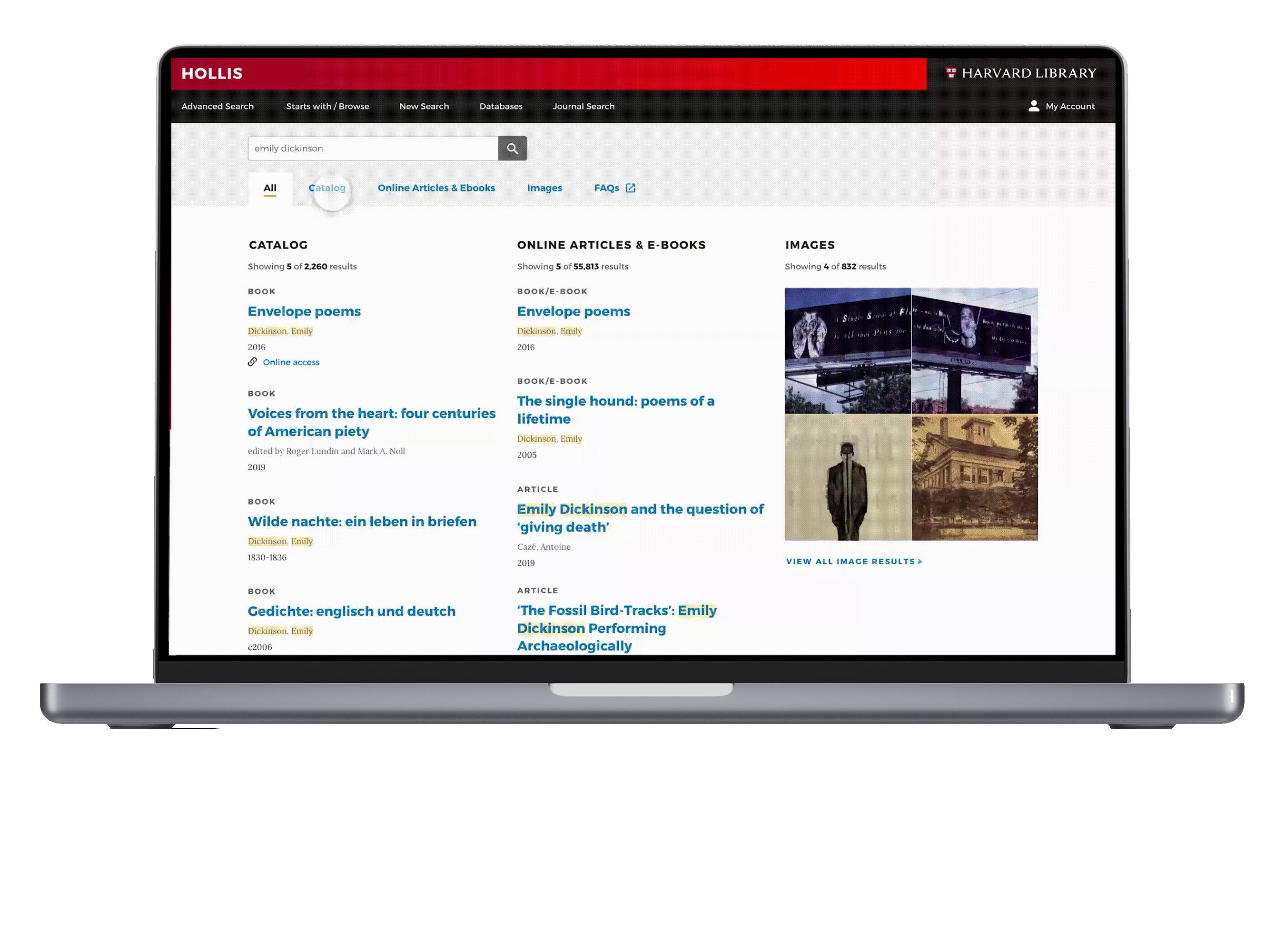
Prototypes of bento box search result presentation pages
• Next Steps
1. Usability Testing
The first version design of the bento layout was done, but I do think that continuous feedback and review could lead to us having even better outcomes. The second stage of the bento project “usability testing” is undergoing.
2. Iterate Design
Keep up with technology development: There might be a more powerful backend system that can solve these problems in the future. Customized interfaces and bookmarks can be embedded to meet the need of advanced researchers.
All researchers, regardless of ability, need access to scholarly information. Making our website accessible is really important. Not only because it is the right thing to do, but it also benefits everyone in the community in a long run. Harvard Library conducts regular accessibility review. And this time, we focused on some new functions that were released and haven't been checked since 2018.
• Tools we used
.png)
• Accessibility Review Process
Step 1 - Plan
1. Set up this project and define reviewing scope.
2. Set up the issues tracking spreadsheet.
Step 2 - Conduct
1. Manual reviews for compliance with WCAG 2.1
2. Automated reviews with assistant tools.
3. Document and prioritize issues.
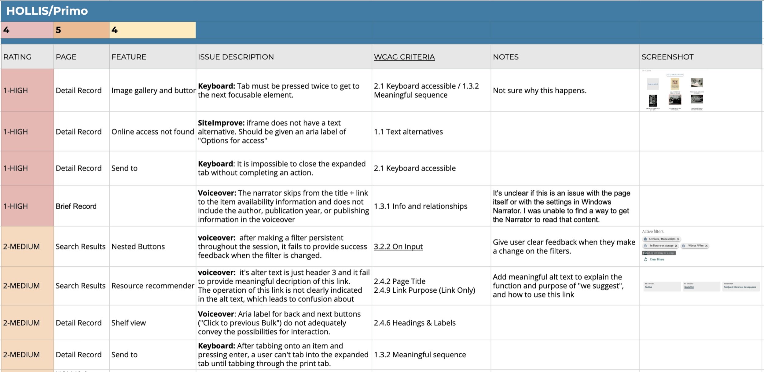
• Issues Tracking Spreadsheet
During this review, we found all these 13 high impact to low impact issues and documented them in the spreadsheet. We included detailed information like the functions, the descriptions, associated WCAG criteria, and screenshots when needed. WCAG criteria is particularly helpful if potentially we need to communicate with system librarians to rate the impact level or communicate with developers to fix these issues.
• Don’t be afraid of constraints! Because it’s often the spark we need to be creative.
• As a UX designer, I should always keep Accessibility & DEI (Diversity, Equity, Inclusiveness) in mind. The earlier you put it into your design consideration, the easier it will be to achieve accessibility in the overall process.