Core by Chloe Ting
Launching a Health & Fitness App
Helping the famous YouTuber build the fitness appEnhanced user connection and engagement through design
Core is the official app by Chloe Ting, the leading fitness YouTube channel with over 3 BILLION views and 25 MILLION subscribers. It's an online platform for users to follow the new programs every month, and join team challenges with other community members. Our goal is to foster a motivated and more engaged experience for users when achieving their fitness goals.
Results
1 M+
Downloads
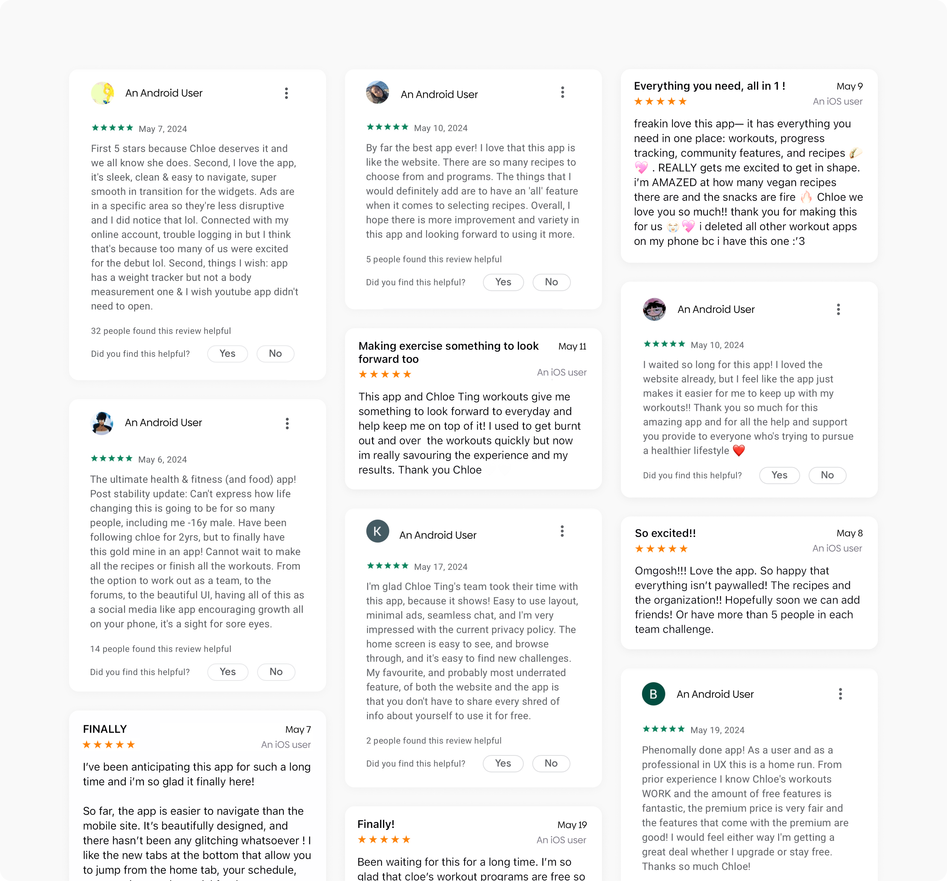
4.9/5.0
Stars ratings over different platforms
9,000+
Reviews on App Store and Google Play
User Research and Analysis
Final Designs
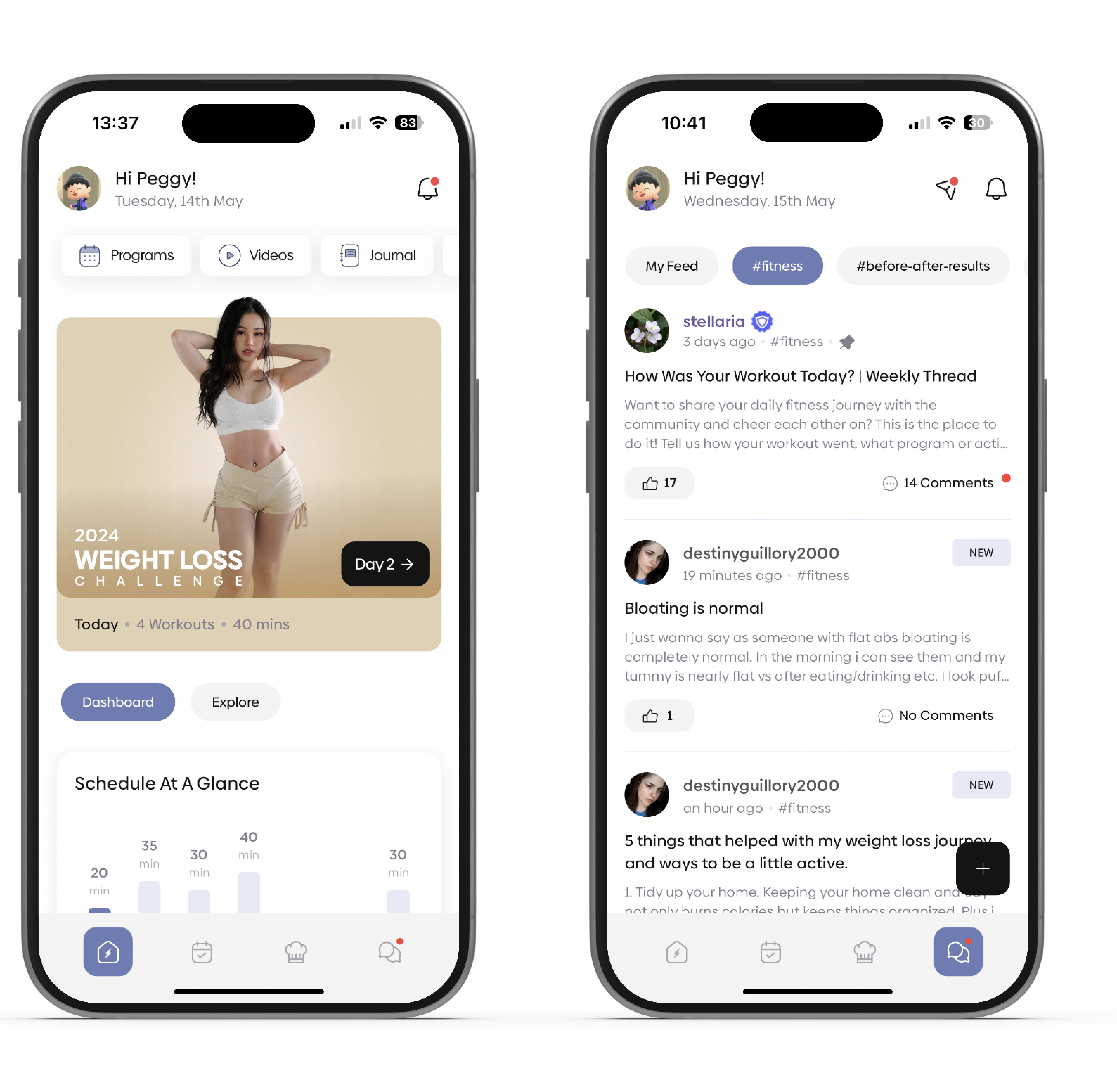
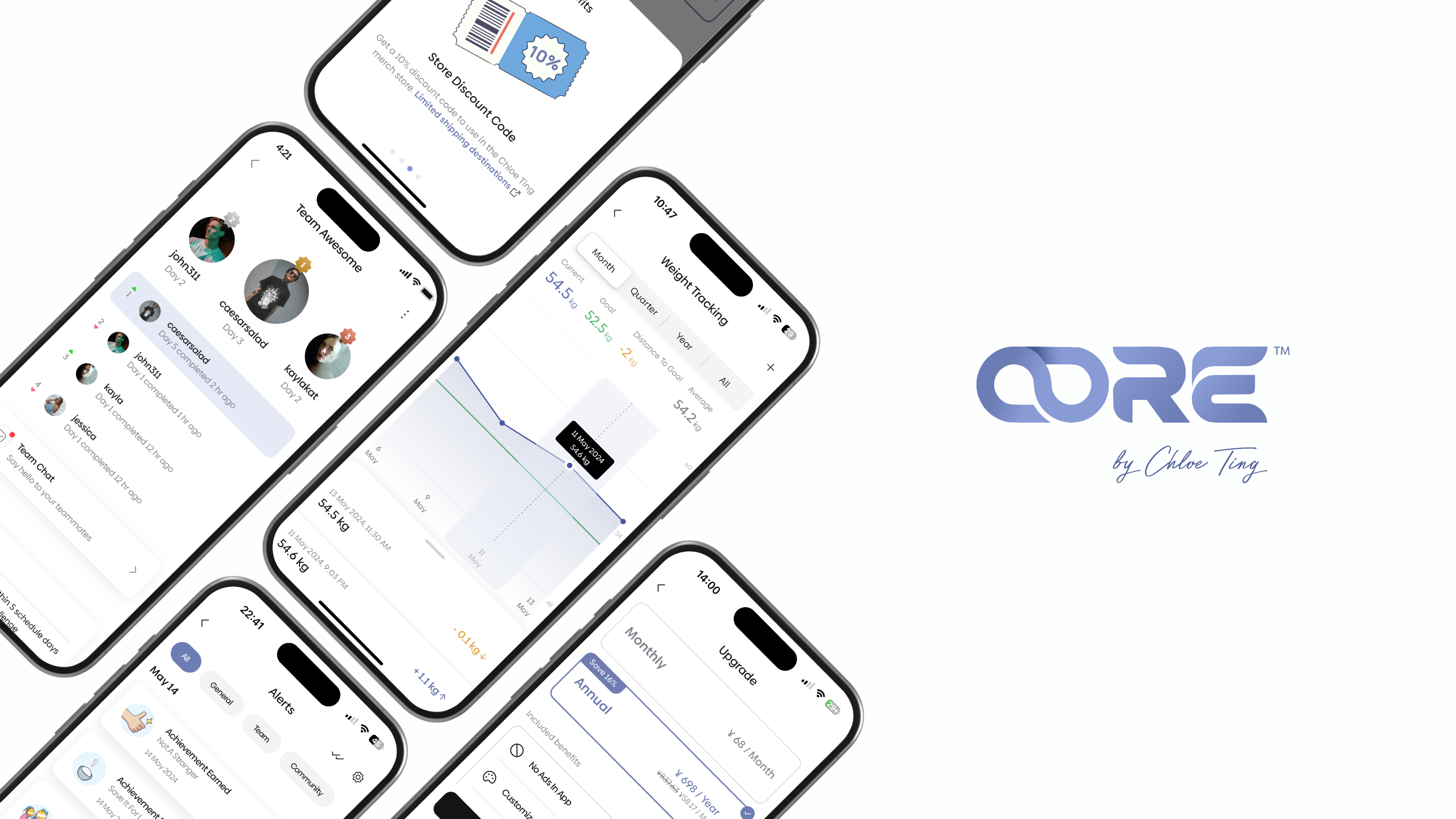
A delightful daily workout experience.
A supportive community to share and explore
Get access to new programs, join team challenges, and share your thoughts with the community to help you stay on track.
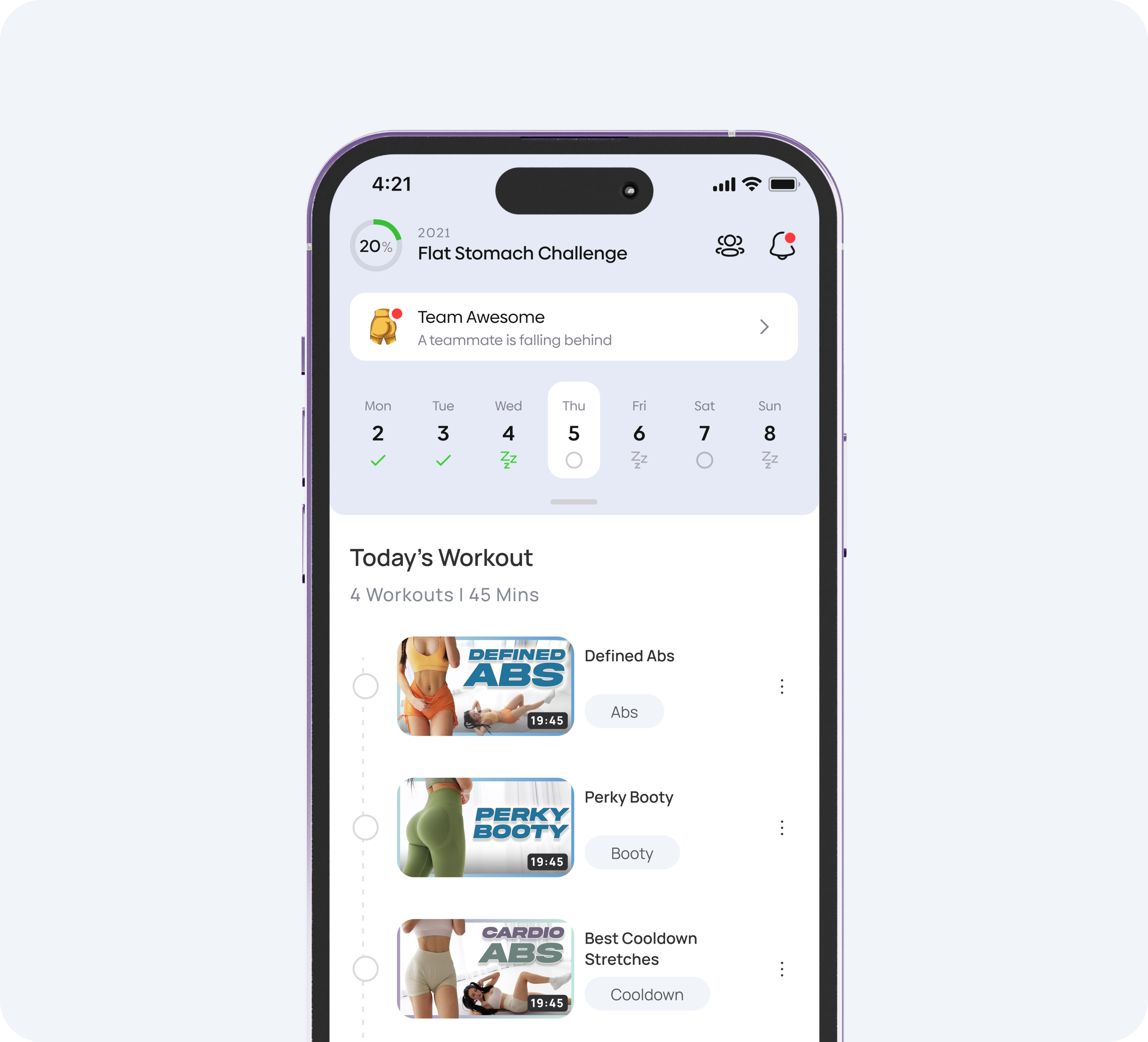
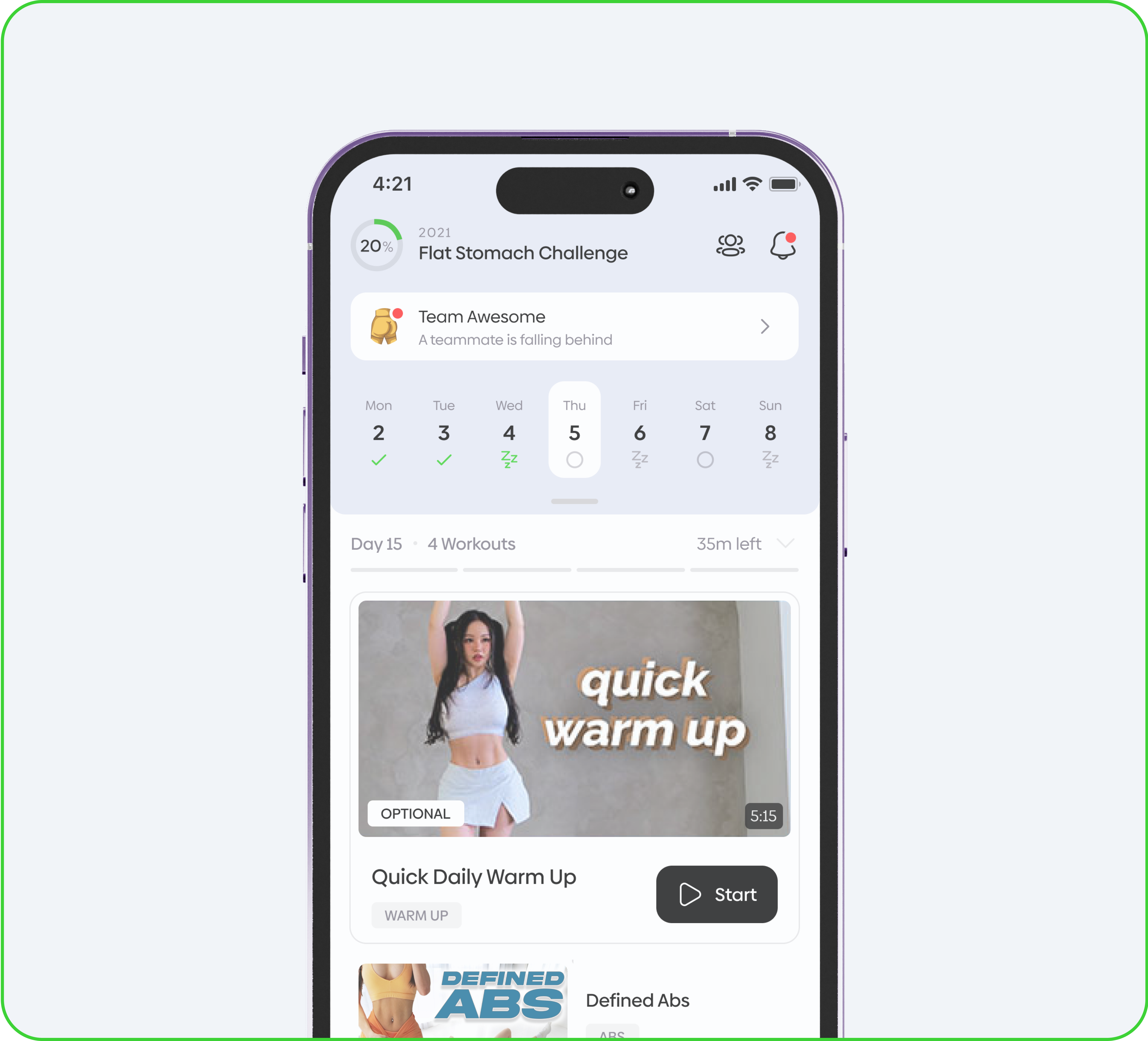
Dashboard: Data at a glance.
Understand your fitness progress and goals with intuitive data visualization.
Dashboard: Data at a glance.
Understand your fitness progress and goals with intuitive data visualization.
Stay motivated. Celebrate every milestone.
Achieving fitness milestones is now more rewarding. Earn badges, unlock rewards, and stay motivated on your journey to your goals!
Health and delicious recipes.
Get daily updates to inspire your fitness meal options, complete with step-by-step instructions for a seamless cooking experience.
Daily schedule of workout videos.
Finish your fitness goal by completing the videos, then enjoy a well-deserved rest day. No need to return on your day off!
Project Overview
Chloe Ting is one of the most famous fitness YouTubers who has over 25 M subscribers. To meet the increasing needs of the audience, we decided to transform their digital experience from the web to a mobile app to keep pace with the increasing needs of fitness lovers. I worked as the product designer in the team to develop an app that would serve the needs of their existing users while attracting new users in the future.
As the only product designer on the team, I collaborated closely with the stakeholders and developers to create a user-friendly experience, launch a brand-new fitness and health app, and re-imagine their existing web experience. Over the course of 16 months, the team launched the “Core by Chloe Ting” app which has over 1 million downloads, a 4.9-star rating, and very positive feedback from its users.
The Problem
This wasn't going to be a standard web-to-app transfer.
• A pile-up of current issues
Our current responsive web fail to provide the most engaging and seamless mobile experience to the audience. Also, the inconsistency issues and usability issues created an unpredictable experience and hurt users’ trust to the brand and the product.

No mobile app: we only have a responsive web that can adapt on mobile devices.

Inconsistent Design: Different elements and colors used created inconsistent feeling and diluted users’ trust.

Usability Issues: hurting conversions and provide an unpredictable experience.
Challenge
How can we echo users' pre-existing trust to build a reliable app that strengthens their connection with Chloe Ting?
We saw that our product had the potential to engage more users, in more meaningful ways. They wanted a comprehensive and engaging mobile experience to easily access her workout programs, track their progress, and foster a supportive community around their fitness journeys.

Iterate Based on Feedback
Clear, consistent, and visually appealing.

Engaging Experience
Supportive community and connection.

Transparency and Reliability
Clear communication and reliable performance.
Update flow
Optimizing the daily workout flow
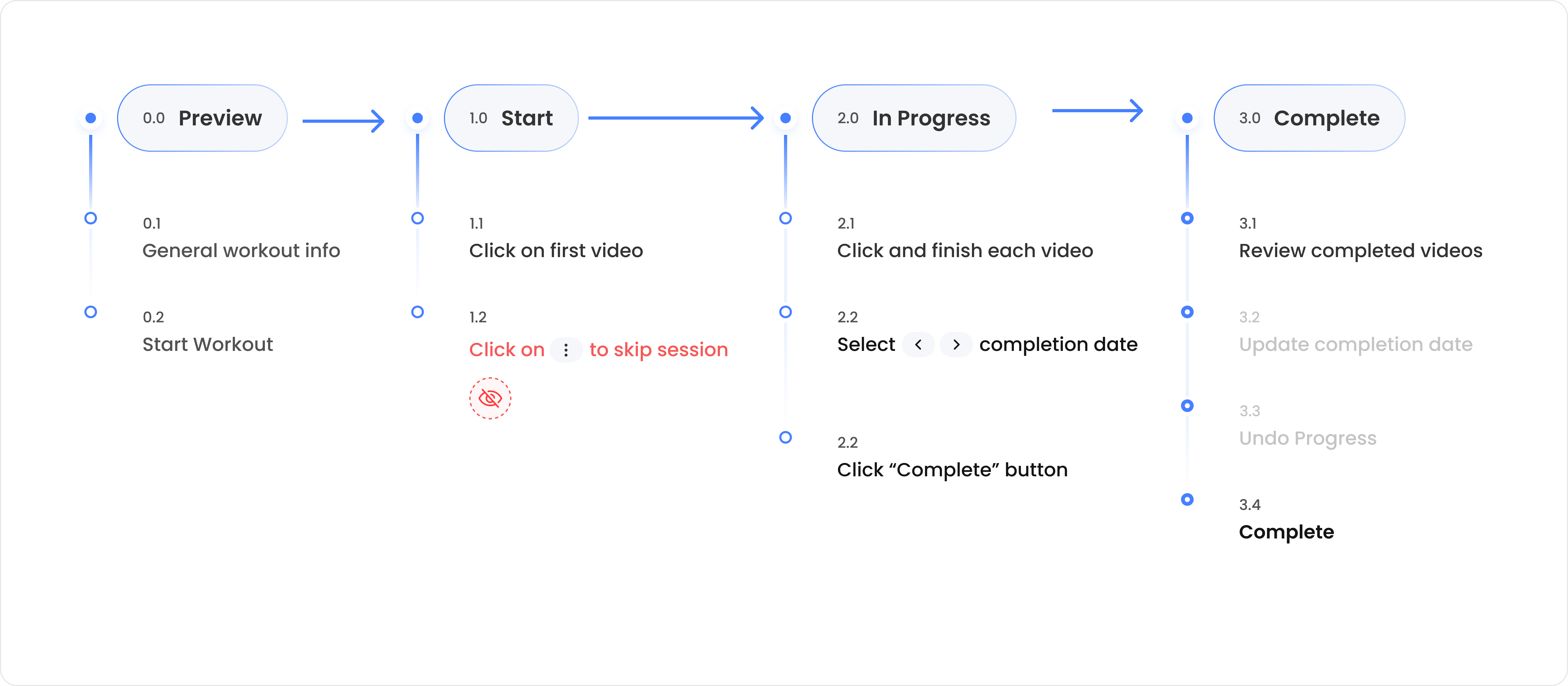
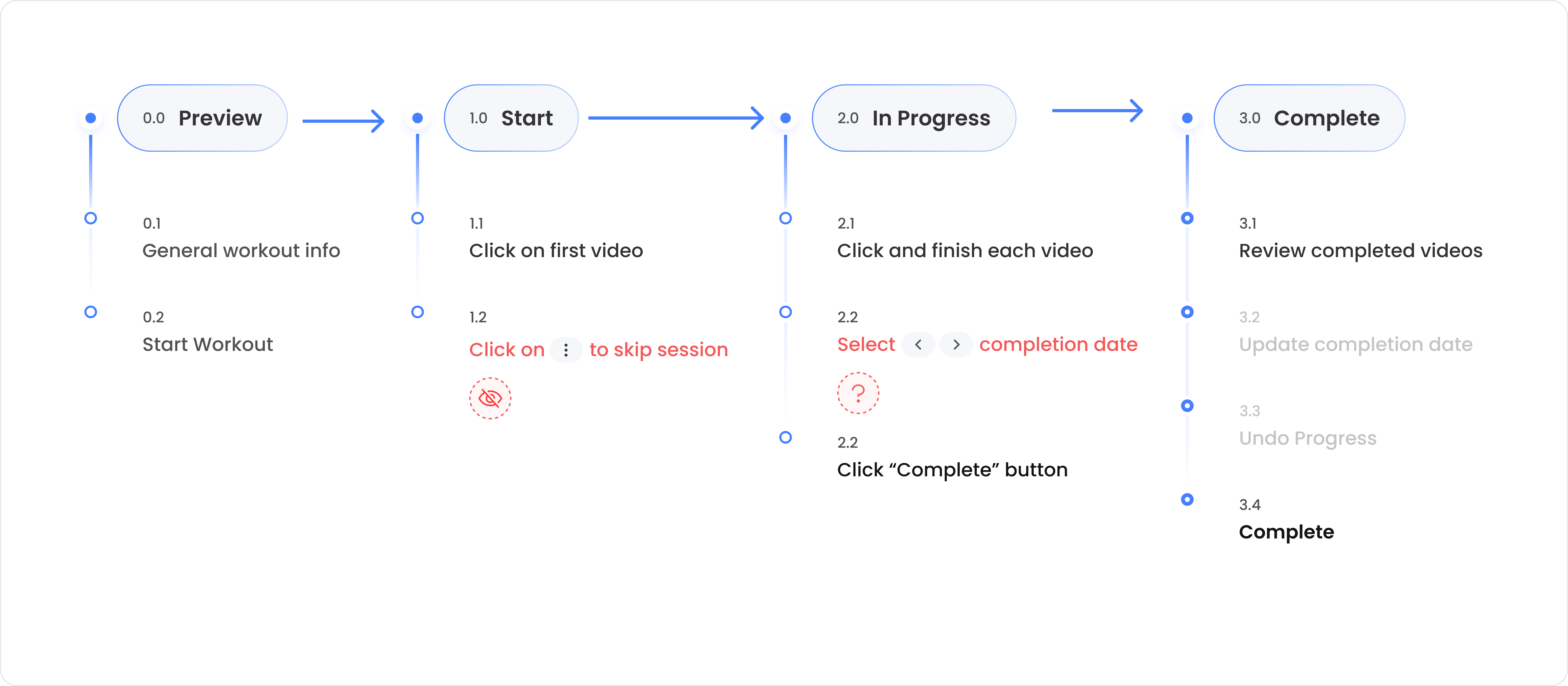
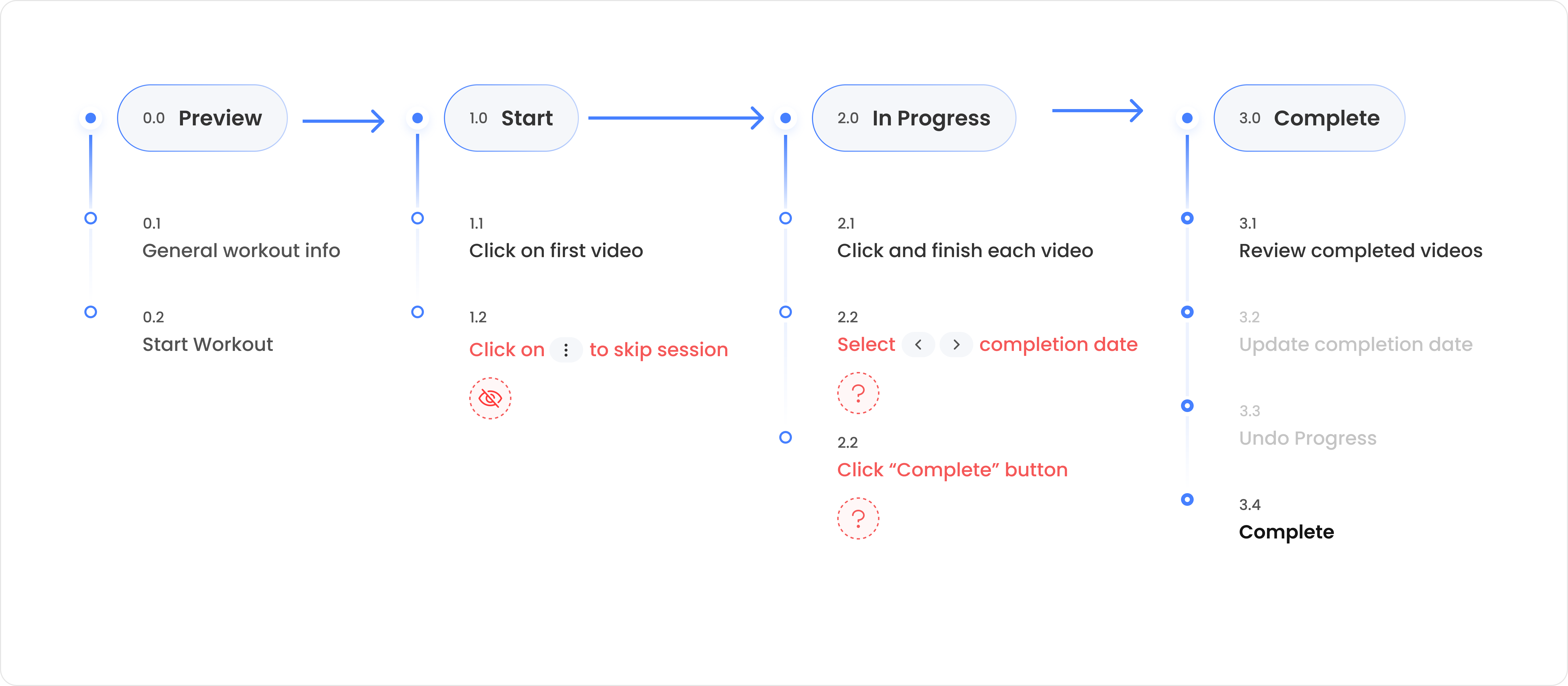
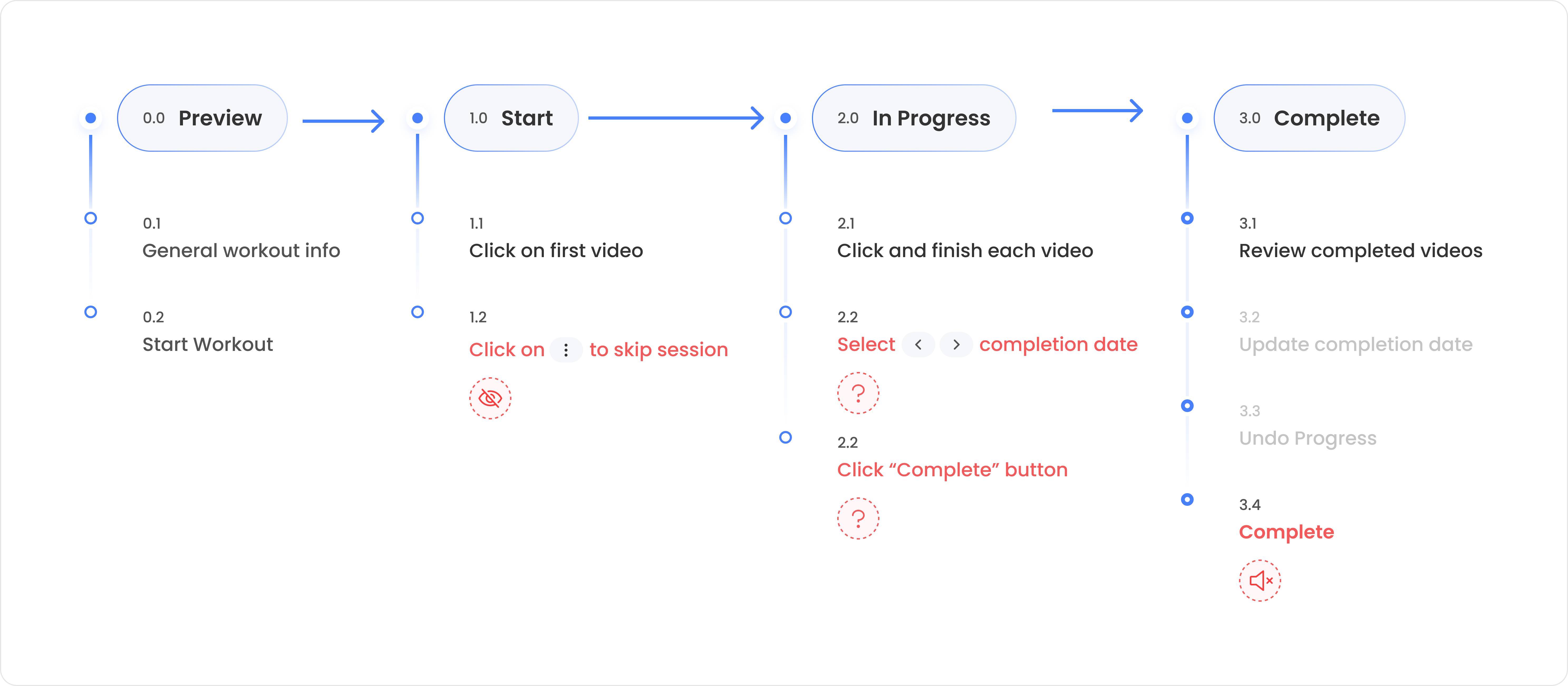
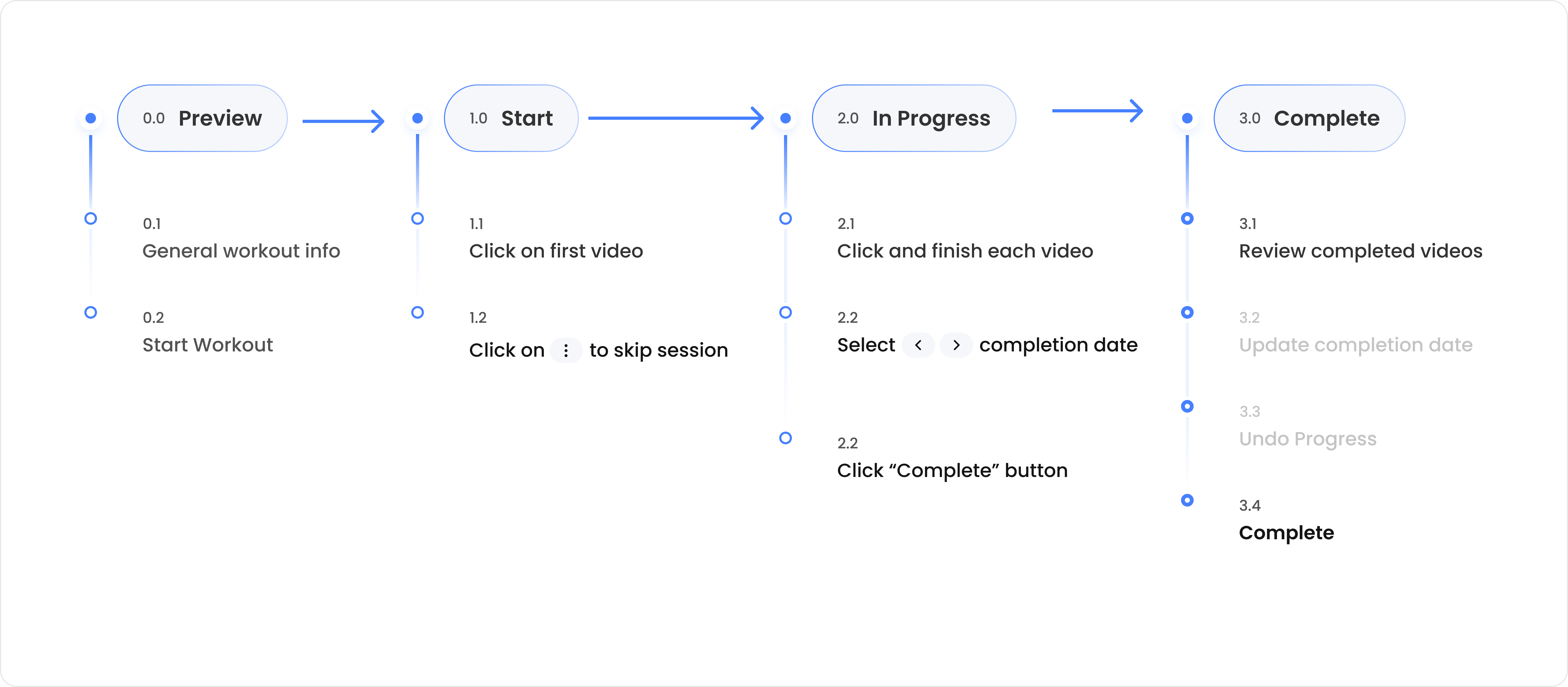
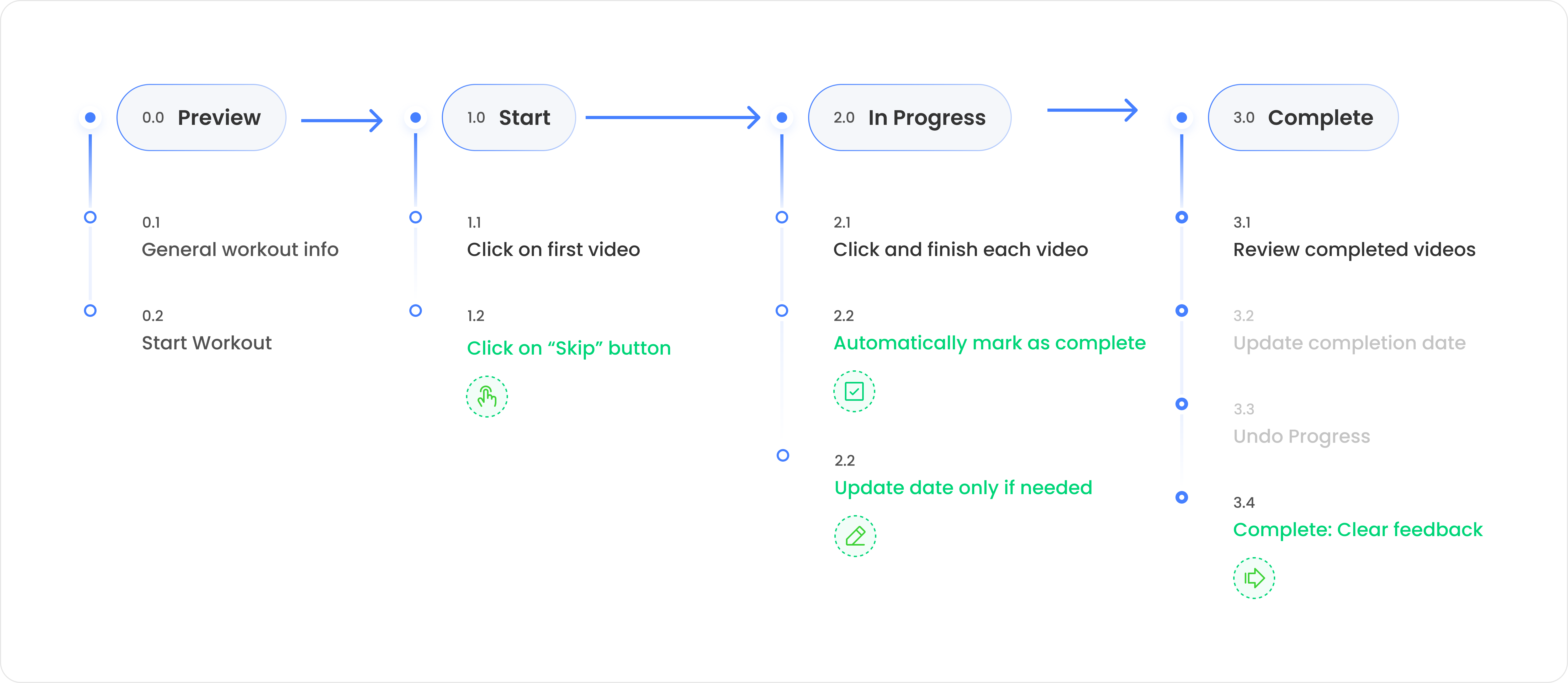
To understand these complex use cases, I began by identifying the issues and simplifying the most typical user flow.
Some heuristic issues included potential user confusion, unclear feedback, and insufficient consideration of edge cases, all of which contributed to confusing interactions.

The skip feature is too hidden - it just feels like it's not an option.

Potential of user confusion - Why do I need to do this? Results in high cognitive load.

No clear feedback if users have completed the daily workout successfully.

Is there a way to clearly guide users through the process and provide flexibility?
Is there a way to automatically mark as complete, making it easy and intuitive?
Is there a way to provide clear feedback upon completion — even motivate users?
• Finding structure within the chaos.
As shown in the Figure below, the whole user flows into four different phases. I carefully considered numerous edge cases that were essential to streamline the workflow.
Most of the issues could be addressed directly with improved instruction and feedback. Additionally, usability issues are fixed to better cater to a general audience.

Auto-complete for 90% of users, with manual options for the remainder.
Backend Changes

Provide clear guidance and improve the structure of the page.
Design Updates

Prioritize the primary workflow to reduce confusion and cognitive load.
Design Updates

Feedback to manage expectation and build anticipation — You did it!
Design Updates
Usability
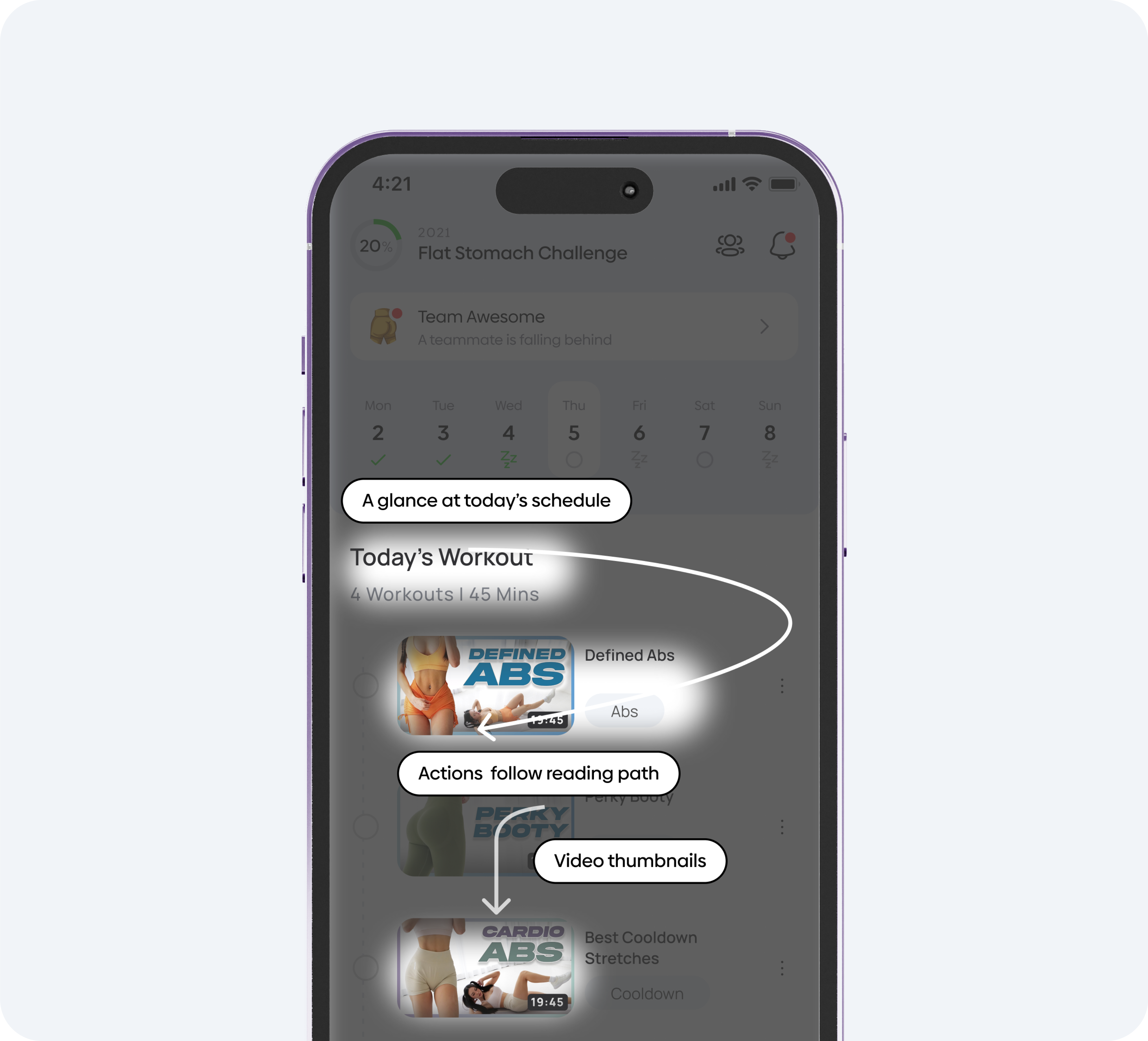
•Schedule Layout - A question of readability vs. scan-ability.
The first iteration aimed to enhance the perception of progression - align with users' natural reading habits. It use a familiar list layout helped reduce cognitive load, while emphasizing readability and sequence.
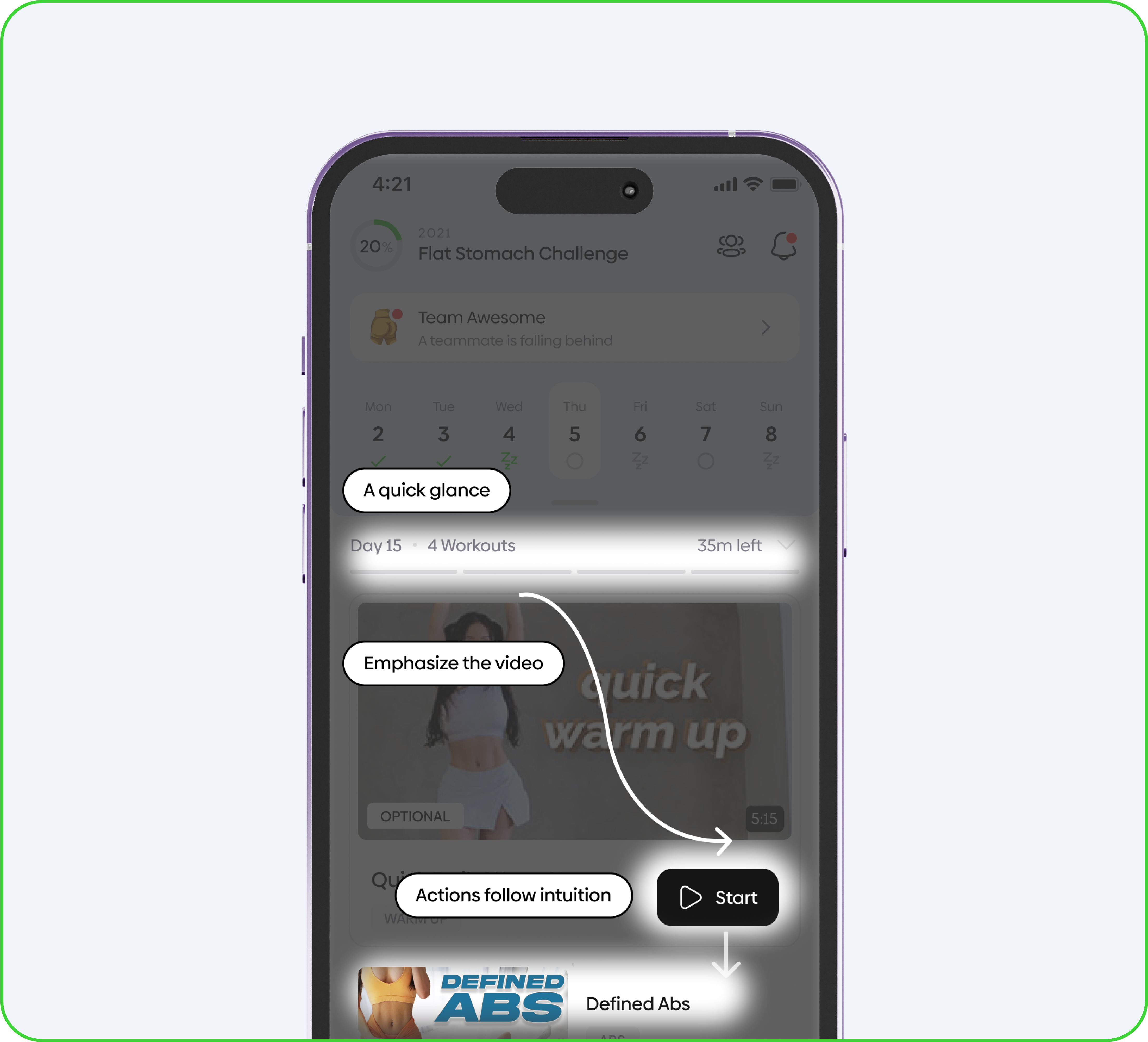
However, early internal feedback noted that it was lack of guidance - The current task was not emphasized enough. This led to a second iteration which we placed greater emphasis on the "current workout" to address these concerns.
While one layout wasn't necessarily better than the other, reducing the amount of content seen at any given moment helped reduce confusion.
Ultimately, the second iteration was chosen for its enhanced scan-ability.

Users are familiar with this list layout so there's less cognitive load.

Focus on readability and sequence. The structure is clear and less confusing.

Motivate users to complete the videos one by one in a sequential manner.

Focus is put on the current step. One thing at a time, less confusion.

Video thumbnail comes first, text become supplementary elements.

Great scan-ability drives users to quickly make decisions. Read only when it is needed.
Interaction
Celebrate every milestone in an engaging way!
•Toast notification vs. Animation.
The initial approach was focused on giving users clear feedback. A toast notification pops-up as a micro-interaction after finishing the workout.
Though it followed the product logic and was technically correct, it was actually less visible and desirable based on user feedback.
I made the pivot to an approach focused on delivering a more engaging and delightful experience.

Ensured that users followed the order and completed daily workout step by step.

The toast notification lacks visibility and may not be noticed by users.
Lacks flexibility - users with physical limitations may find it non-adjustable.
The animation upon completion provides engaging and delightful feedback.
Complete flexibility, with clear instructions and structure for easy navigation.
Design System
Consistent experience. Scaling made easy.
•Versatile and responsive.
I started from buidling components that were highly-crucial to the overall app experience, prioritizing readability, responsiveness, flexibility, and seamless performance across both iOS and Android Platforms.
I put a lot of emphasis on documenting design spec to ensures speed and consistency from concept to development and QA.
Outcomes
A sweat ending and huge success!