
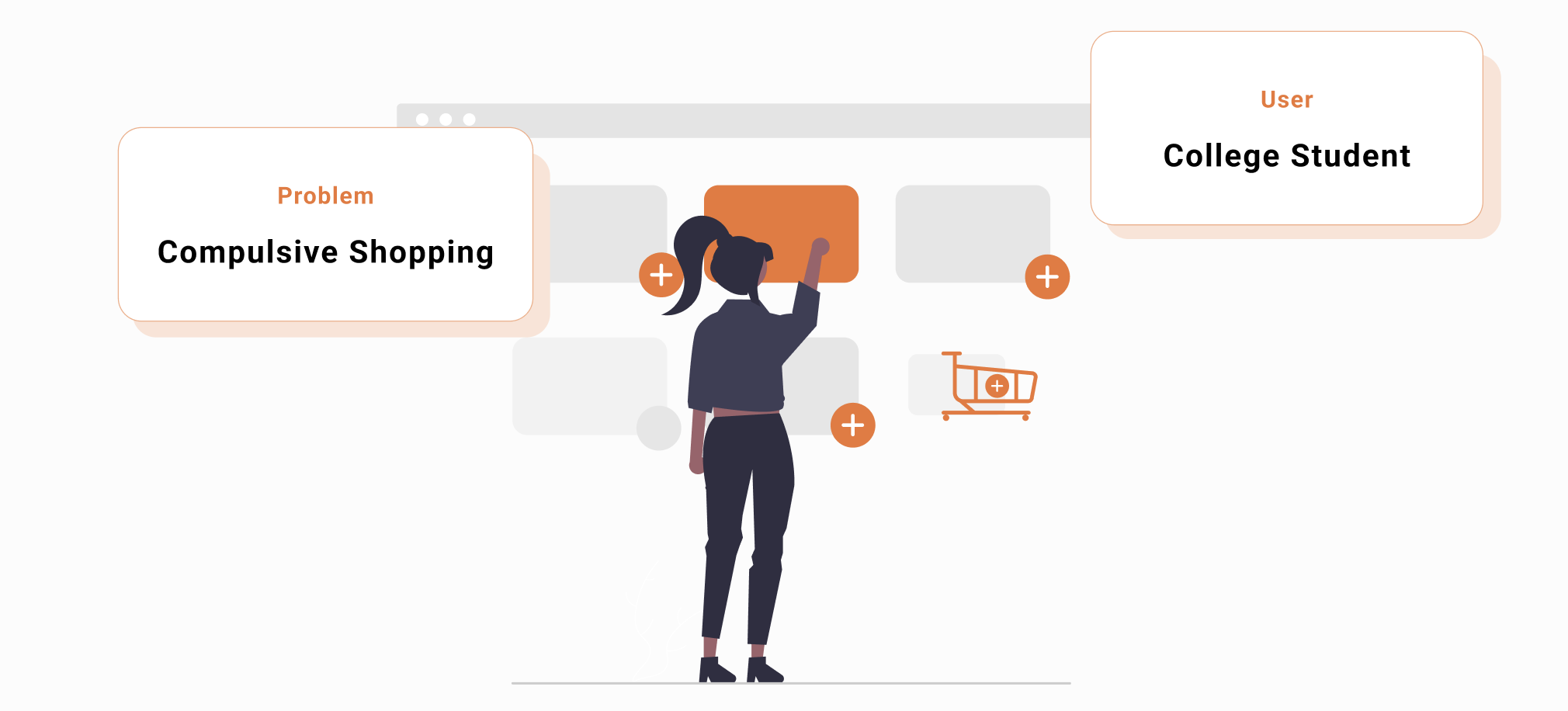
How can we help university students to reduce compulsive shopping behaviors, understand their consumption needs, and cultivate good financial behaviors?
After geting a better understanding of users' need and pain points, we designed this Billionaire App. In Billionaire app, users can set goals for shopping budget, keep track of expenses, stay motivated with friends community, and park the item in the holding cart. Focusing on user experience design, we delivered this end-to-end hi-fi prototypes and detail development plan at the end of this project.

We adapt three main research methods (literature review, survey, and user interviews) to gain both qualitative and quantitative types of data. By doing these research, we want to get better understanding of the following questions: 1. How do they feel during the whole online shopping process? 2. What are the motivations and psychological reasons during the online shopping process?

Finding - Literature Review
By conducting literature review, we understand there are two groups of people who seem especially susceptible to shopping addiction: University students (8%) and Women (92%). Compared with other groups, the condition of university students is more special. Most university students don’t have regular and static incomes. What’s more, college students have unmatured consumption concept and weaker self-control ability, which might lead to some serious financial consequences. So we deicede to scope down our target users to college student.
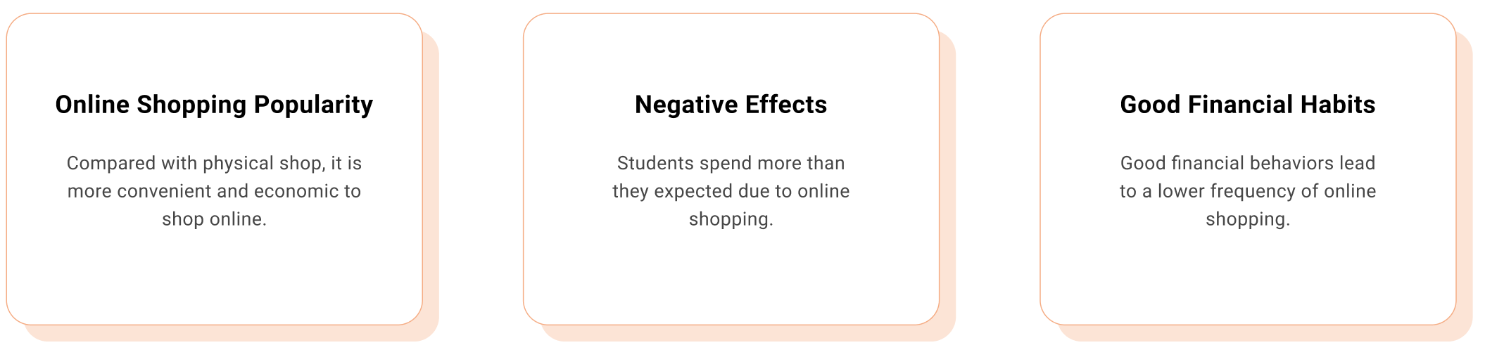
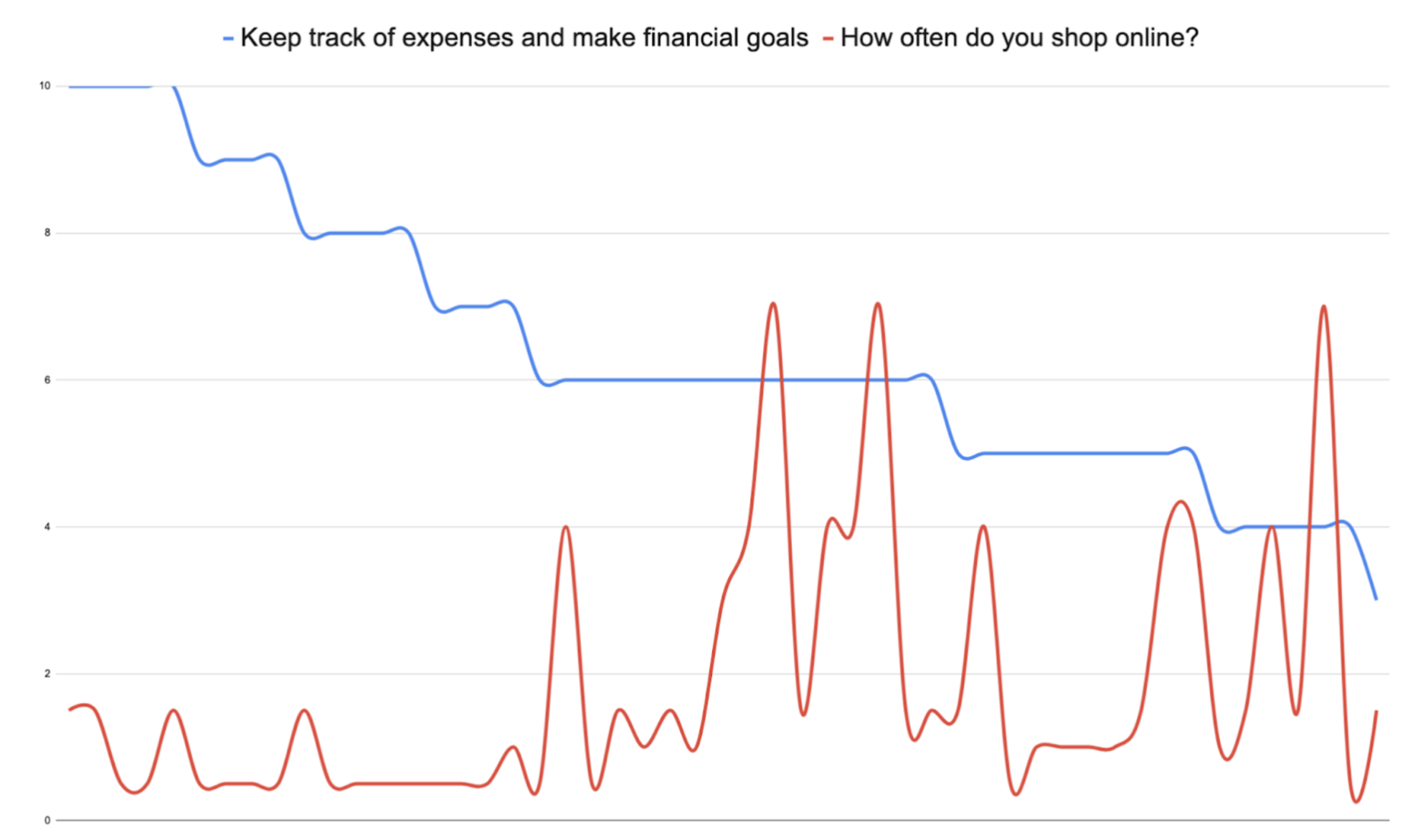
Finding - Survey
Although there are other researchers who have conducted compulsive shopping studies before, we believe it is necessary to conduct survey that focus on college students who have compulsive shopping behavior instead of general population. We want to know whether these financial factors will influnce their online shopping behaviors.
Finding - User Interview
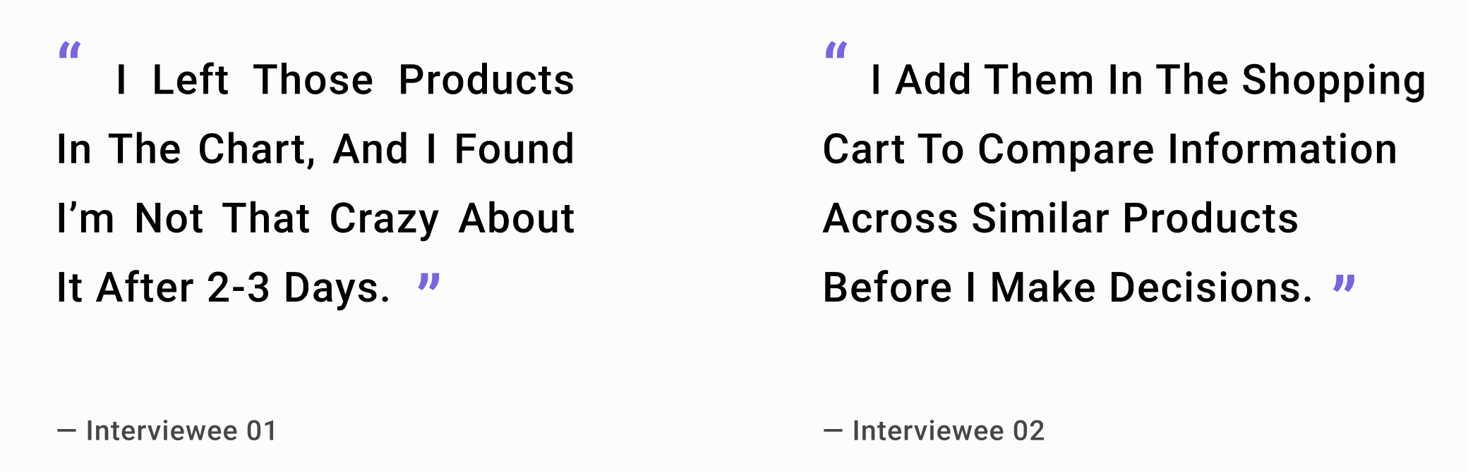
We complemented our survey results with interviews to learn more about the whole process of online shopping and more detailed information that we cannot get from survey. We recruited those survey respondents who met compulsive online shopping conditions to learn more about their psychological reasons behind online shopping addiction. During our interviews with target users, 50% of our interviewees mentioned that make use of shopping carts can help them make rational decisions and only buy products that are needed and suit them well, especially for clothes and make-up.
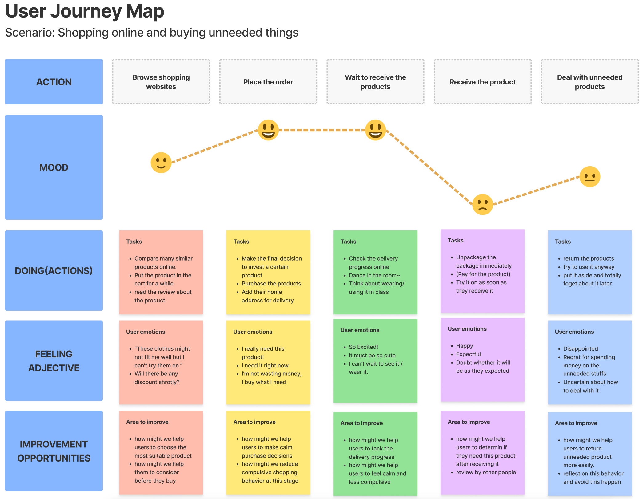
Throughout our interview with our potential target users, we realized there are different stages regarding the moods and behaviors of our users when they shop online. And we believe it is important to understand their feelings and thoughts, so we can better help them to improve their behavior in potential opportunities. We use a journey map to analyze and demonstrate this process.
We brainstormed as many ideas as possible on our own, which helps us to divergent thinking about possible solutions. Then we discussed the pros and cons of each of our ideas and convergent our ideas to two promising concept below that we want to explore further. We also conducted speed date with our friends and classmates to get their feedback and test our concept.
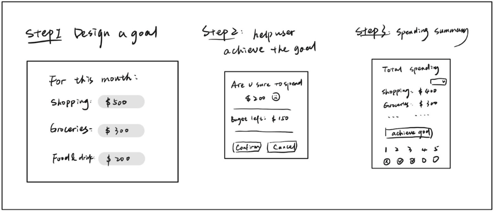
Concept 01: Budget plan and spending summary
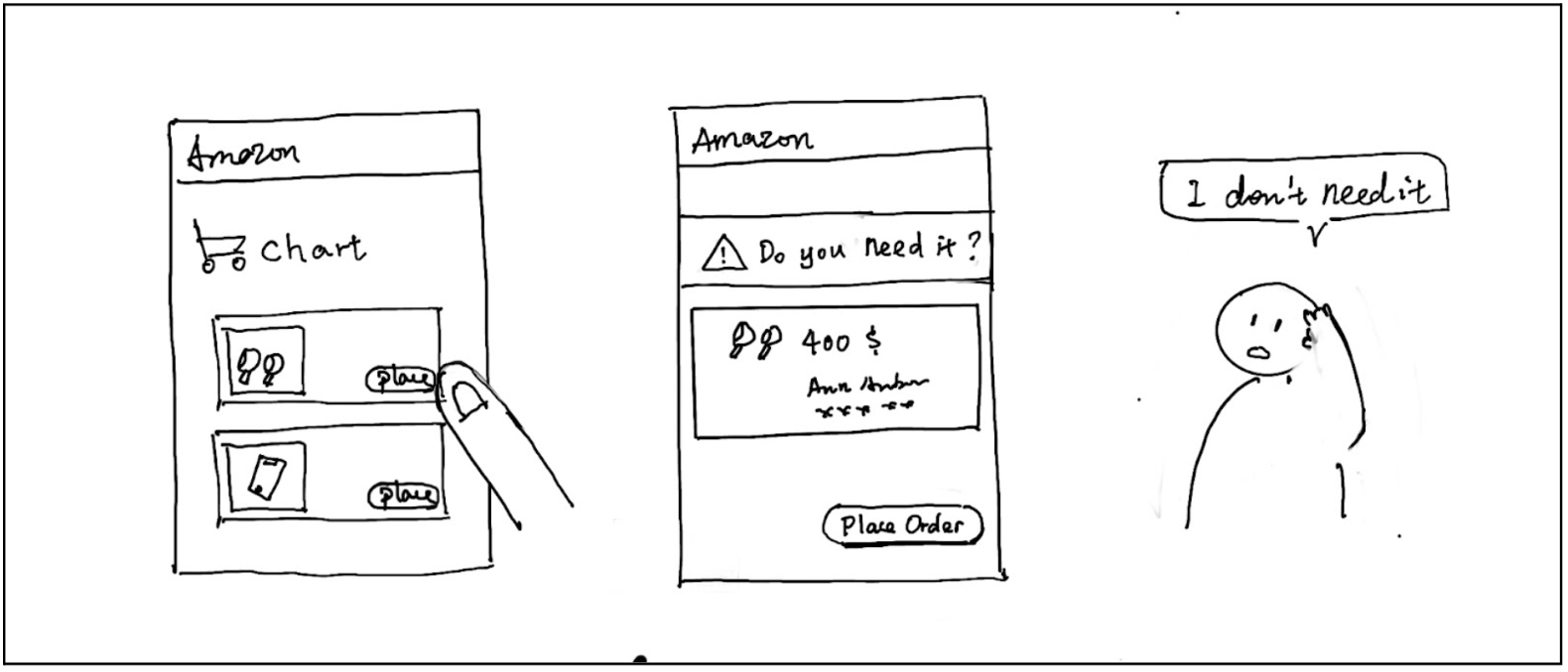
Concept 02: Temporary shopping cart
Concept Testing
To quickly test our concepts, we used speed dating method to interview different people and gain their feedback in a short period of time. They talked about what part of our concept they like and dislike with very practical reasons, which helps use to better understand users' needs. Although they believe these two concepts would be very helpful, they still feel a lack of motivation to cultivate and maintain healthy financial habits.
How can we motivate users to maintain healthy and sustainable shopping habits with our design?
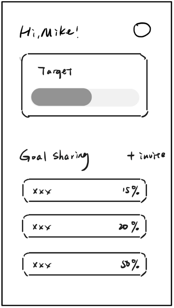
We then did some research about motivation in digital products. And some common methods are the freemium model, gamification, point, tiered system, social proof, and goal setting. In our design concept, we already apply the goal-setting feature by letting users set a weekly/monthly spending goal. And from the peer feedback, we got some advice about adding social proof features, some of the participants have used the apple watch share activity feature, and found it’s really helpful to stay motivated. With that, we decided to combine these methods, let the user first set a spending goal, then share the goal with their friends to compete with each other, and once the goal is accomplished, we will use the reward system to encourage users to keep their behaviors.
From the data of previous study, the basic design concept has been decided, which is to help college students control their compulsive online shopping behaviors and develop good financial habits. In the design part, we foucused on user flow, information architecture, hi-fi prototype, and the implementation plan.
Sketch
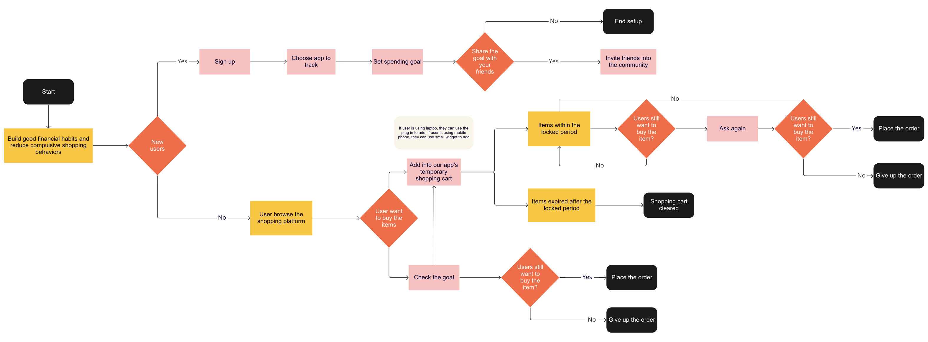
User Flow
We started mapping our users‘ experience with a user flow chart on the Miro board. Here below, we attached the final result of our app’s user flow chart. By making this user flow chart, we have a deeper understanding of how to make the interfaces and we also got the opportunity to evaluate and optimize users’ experience again.
Information Architecture
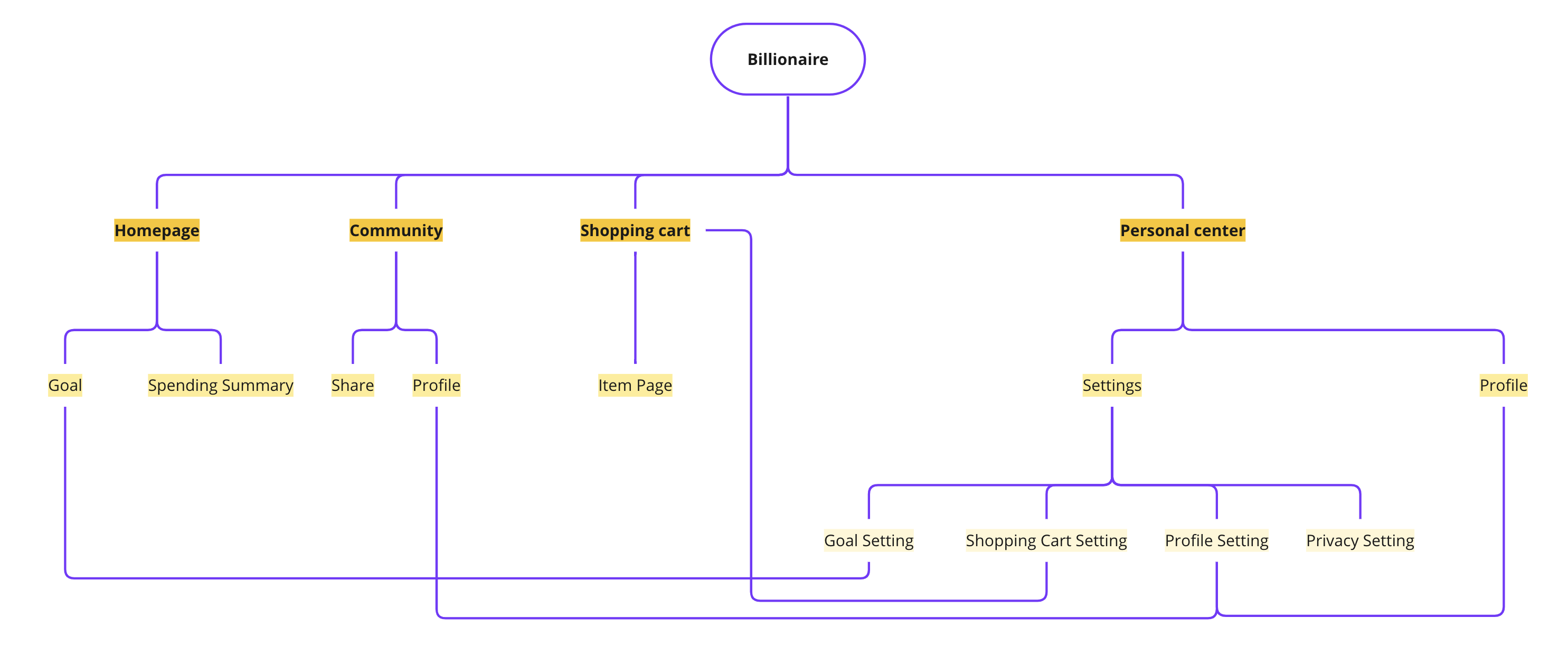
After mapping out the flow of our users’ experience, we dive deeper into the information architecture of each page in order to better realize our app's features and functions. It helps us to improve the usability and findability of our application. We aim to create an app with a more intuitive user experience by clearly classifying information. By doing information architecture, we think about the following questions: What information are we going to present on this page? How much information should we present to users on this page? How do users browse or move through information?
Further usability testing is needed to validate our current information architecture model. With more feedback from our end users, we can iterate our design to make it align with users’ preferences and expectations.
Wireframes
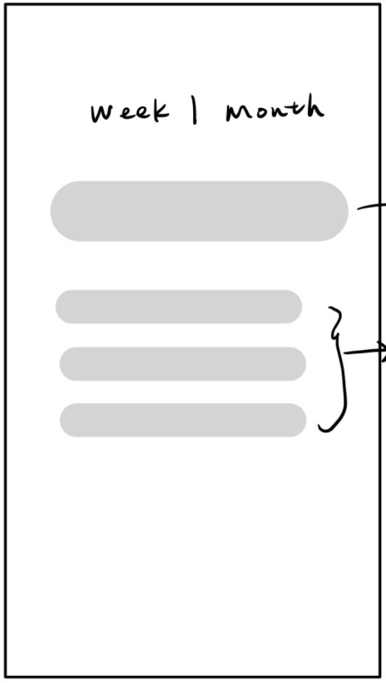
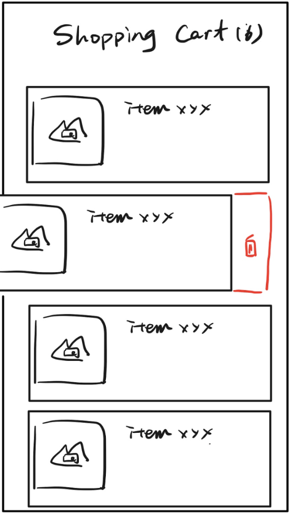
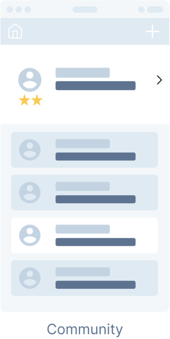
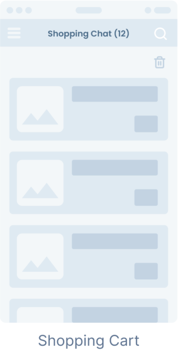
By using wireframes, we decide some basic layouts and functions of every page. In this stage, we mainly focus on four pages. The [Homepage] and [Personal Center] mainly include some basic information about users themselves. The third page, [Shopping Cart], shows one of our key features, to help users control themselves. The fourth page, [Comunnity], is another key feature to let users share their goals with others.


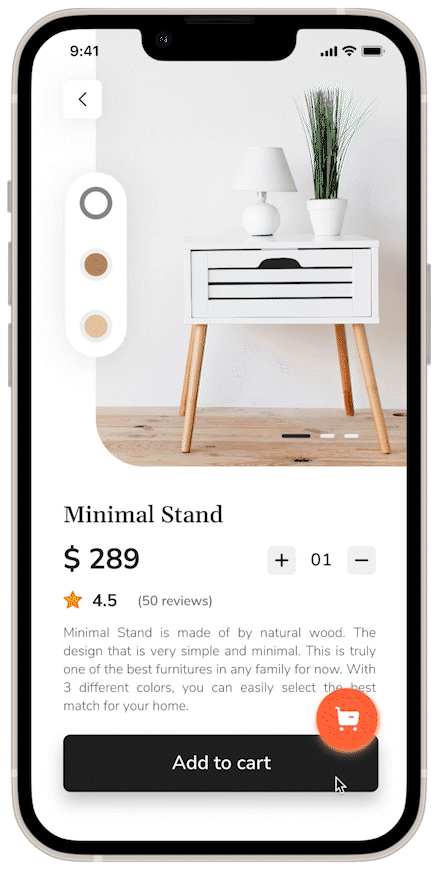
Hi-fi Prototypes
For the mobile application, we used Figma and framer to build the high fidelity prototype to demonstrate the key features and interactions about how users will use and interact with our product. Framer will be used to build the interactive prototype since it has rich built-in components which are pre-coded and interactable.
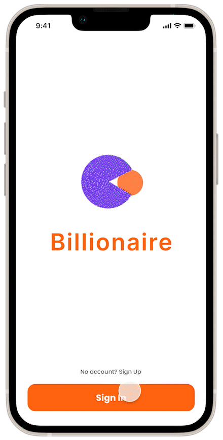
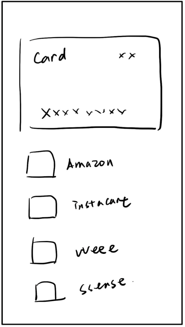
When you first use the Billionaire, you can sign up easily. During the onboarding process, you can set up budget goals, choose the shopping applications you want to track, and set a “calm down” time period to park items in the holding cart.
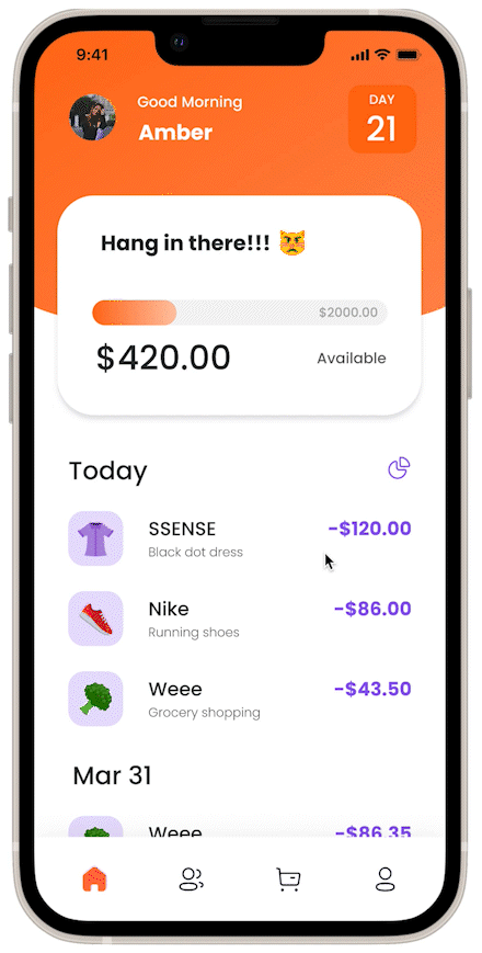
You can check your shopping budget on the Billionaire and see how much budget is left. You can also go to the statistics page and figure out where your money goes. You can see your daily, weekly, or monthly spending trends and your top spending records on this page.
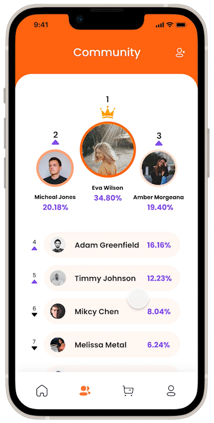
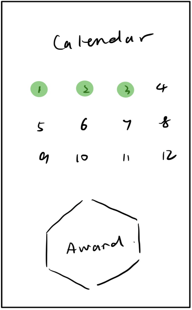
You can invite your friends to join the Billionaire community to motivate yourself. After your friends join the community, you can view each other's progress on the leaderboard. With the encouragement of the community, you successfully reach your goal and win your first achievement: a perfect month.
You decide to park the item in the holding cart first. After the "calm down" period you set by yourself, you have totally forgotten this item and our holding cart removes the item from the cart to invalid items automatically.